Some process images
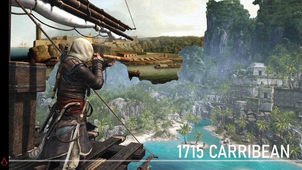
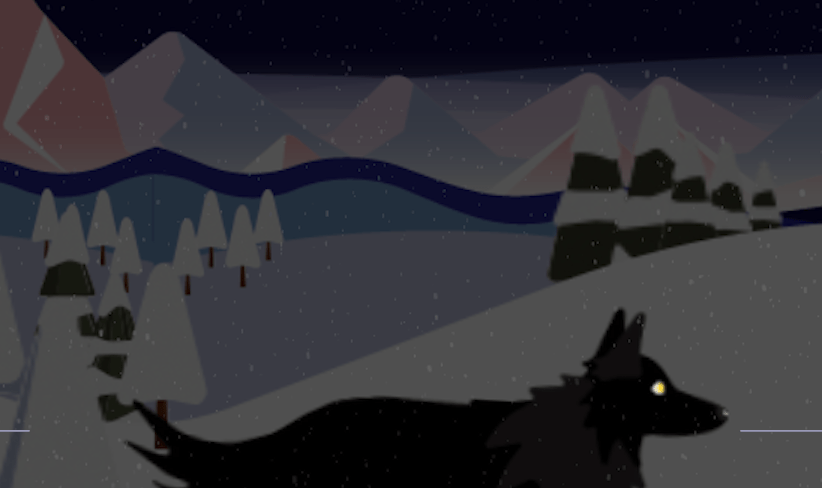
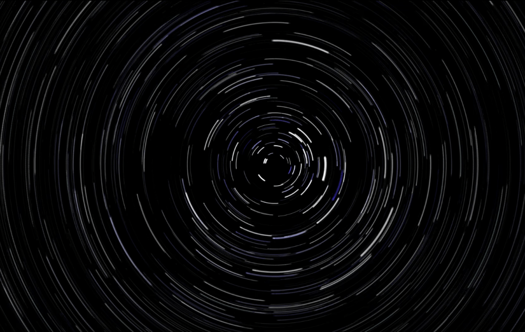
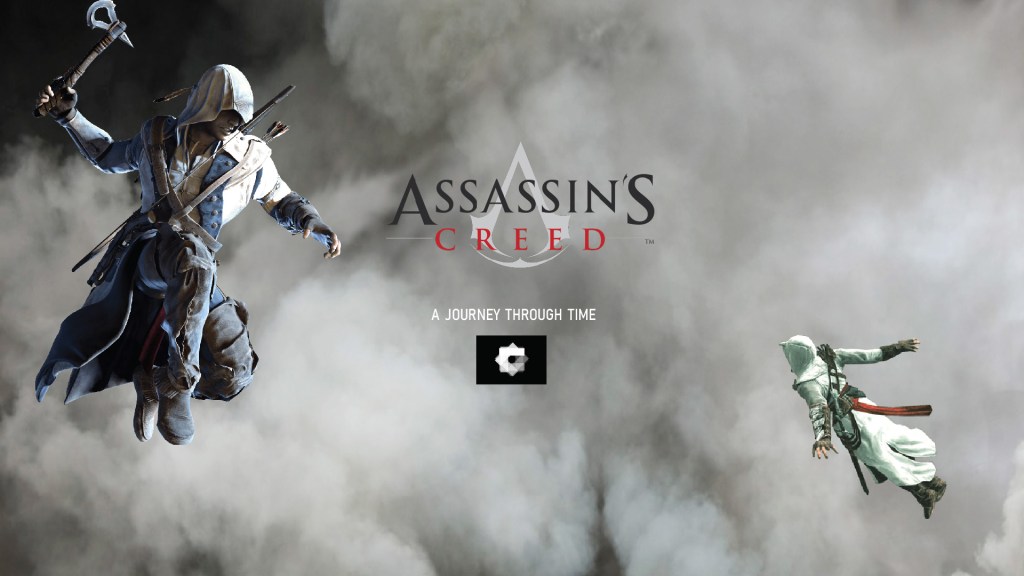
LOADING SCREEN
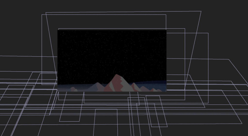
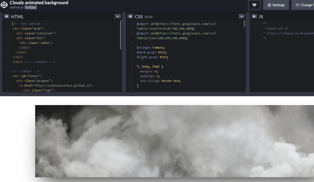
CODE PEN LOADER:

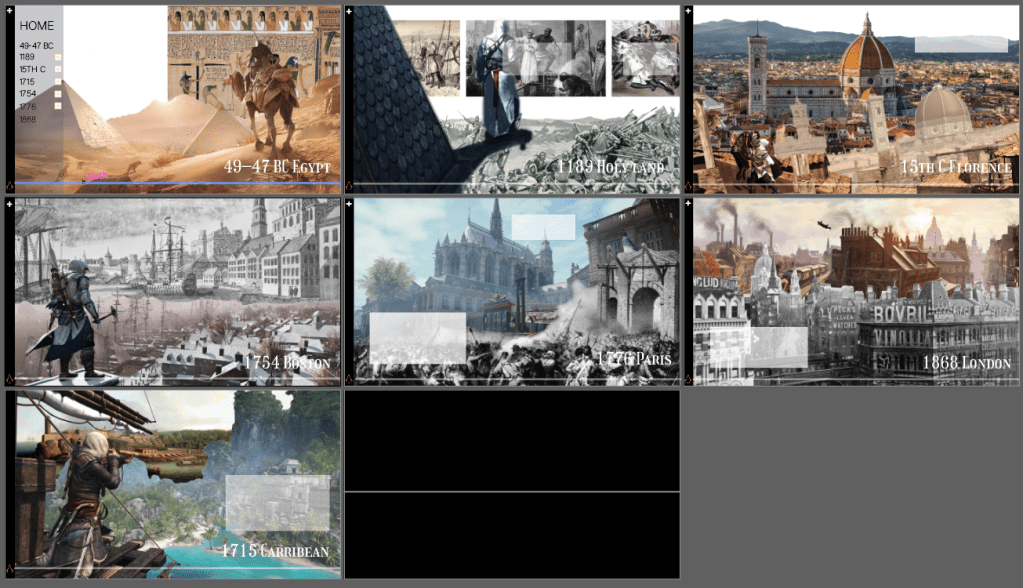
LANding PAGE
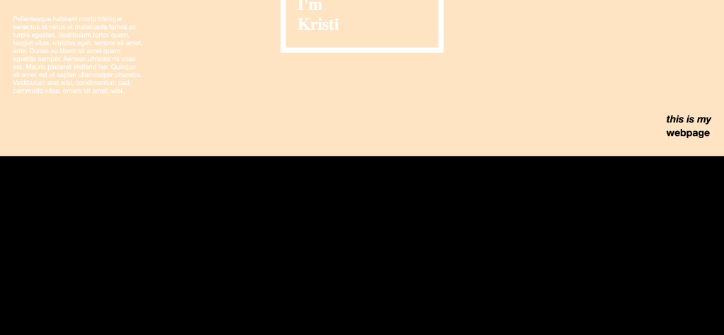
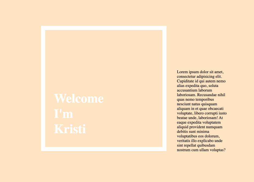
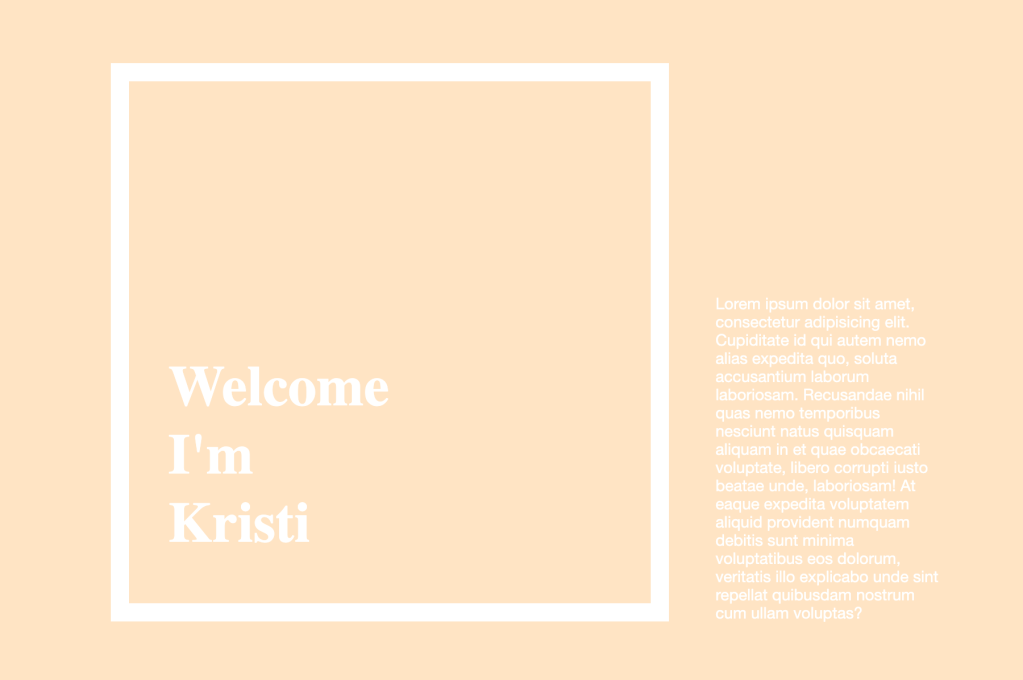
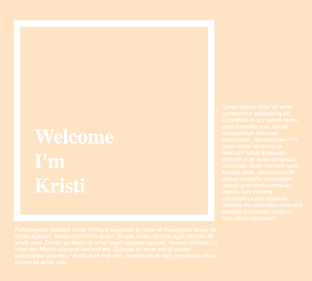
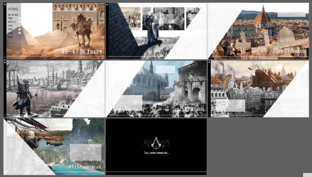
So BASICALLY het my ai design doc nie reg gesave nie so ek het van my goed verloor. Was seker te moeg gister aand idk. But i had some pics on my phone so u can kinda see whats going on
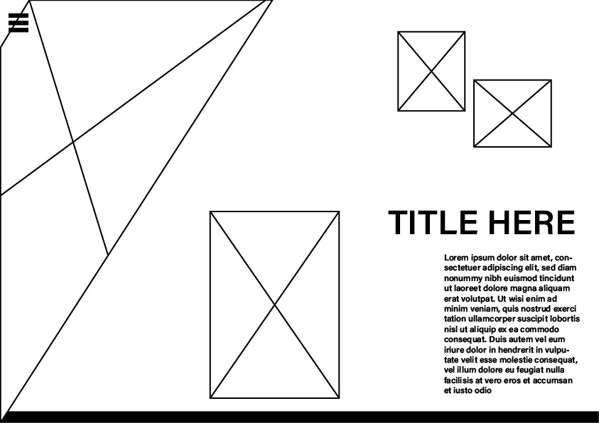
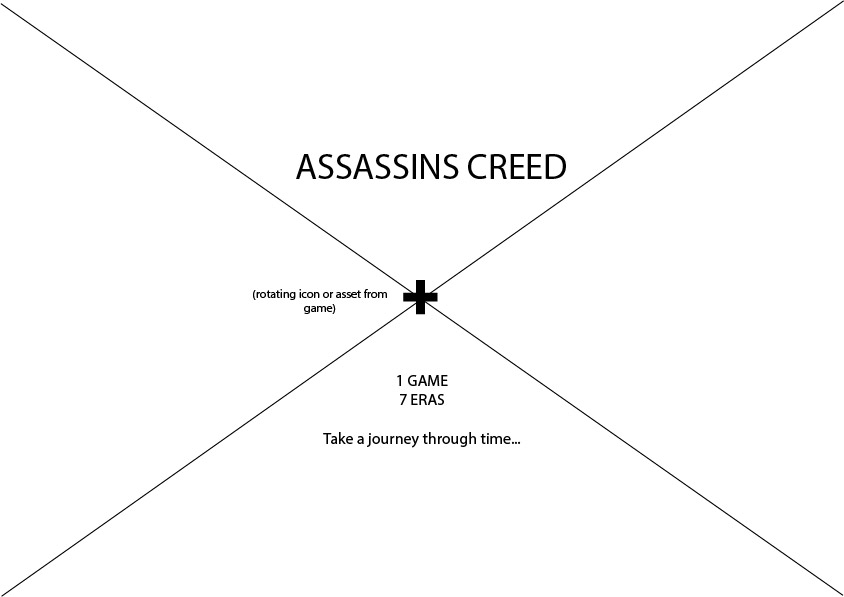
The landing page’s design is the one page I’m undecided about design wise. Assassins Creed’s loading page is that white background with weird moving white line things. So I thought I’d imitate that effect but with triangles.
My idea for my landing page is to put the assassin pic in a container and when you hover him, the other shapes move like in your 4th parallax tut.
Assassin = controller, when you hover him the triangles move around
I dont know if I should make some of those pictures^ smaller triangles and put them inside the white line triangles, or if itll look cleaner with just the shapes. It might look nice if all the images are b&w.
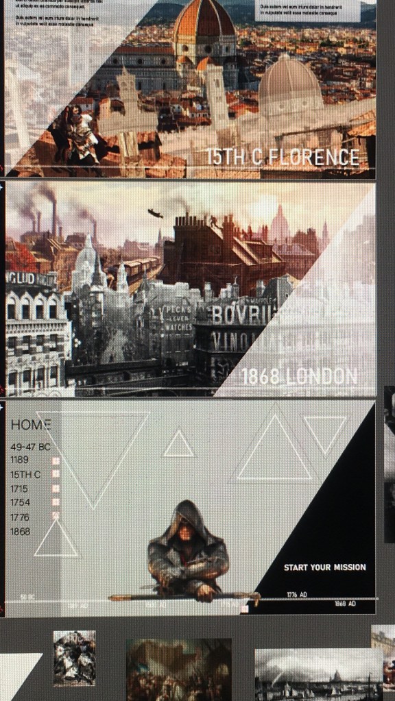
The START YOUR MISSION can be a button, but because you just scroll right it might be kind of pointless.
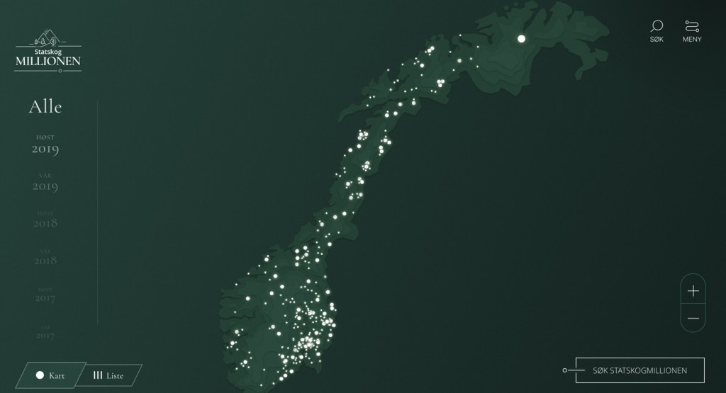
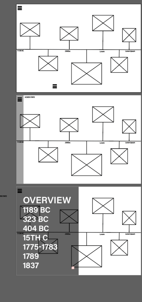
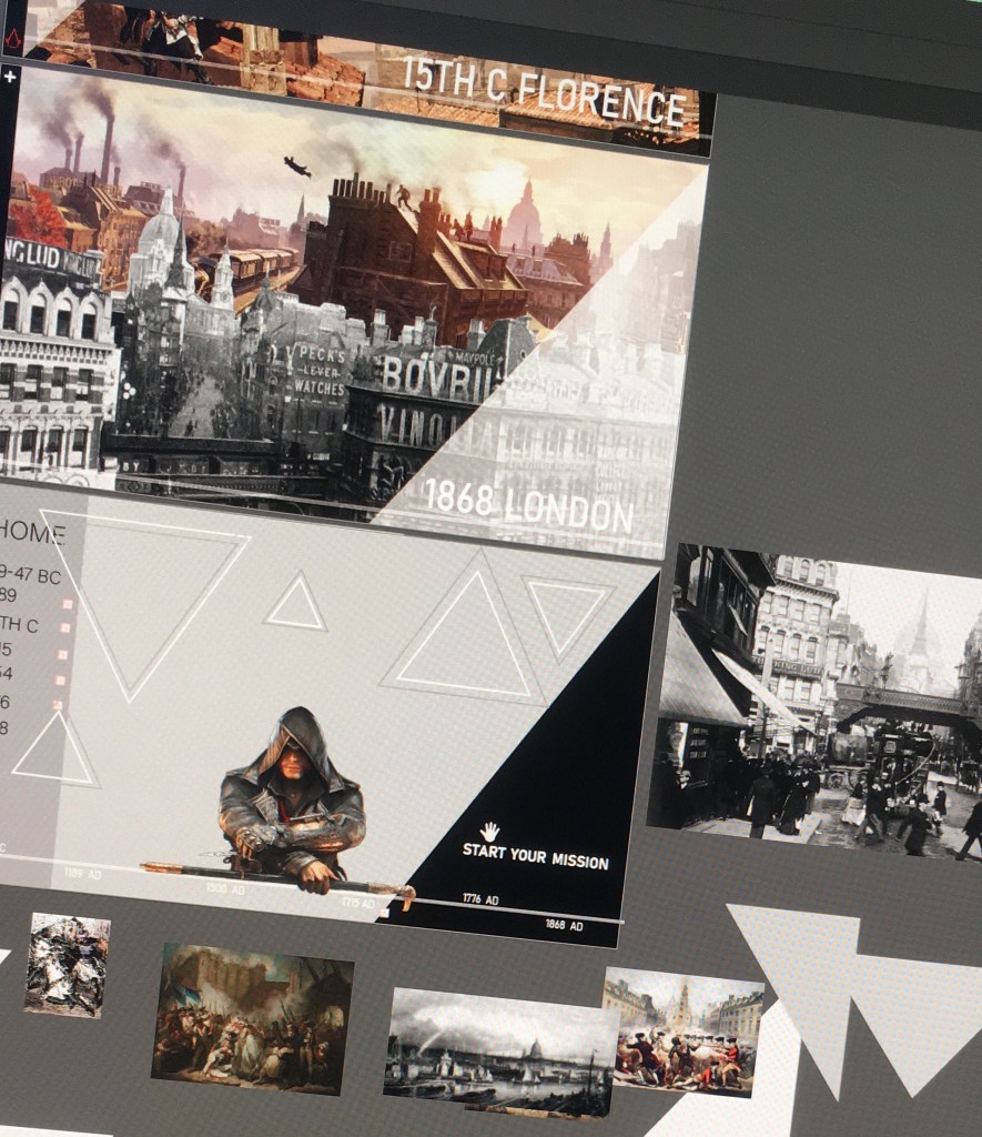
Navbar is a classic slide out menu, but I thought I could turn the timeline into a navbar as well where you can hover over the dates and it links to the pages.
Or: Scrollbar/process thingy? I wanted to find a tut for something like this but idk what you call it.
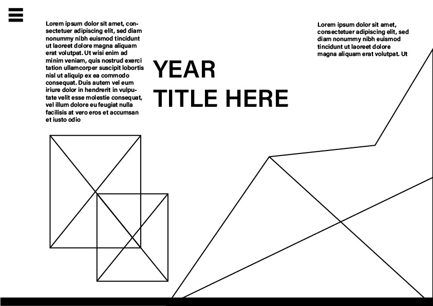
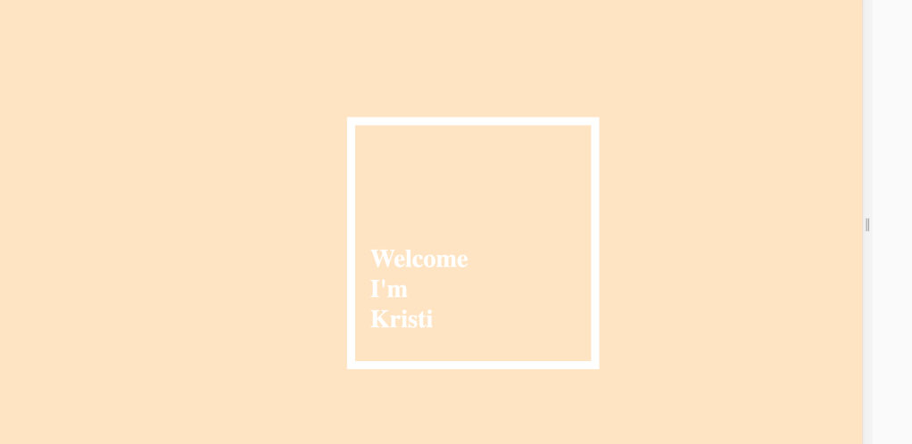
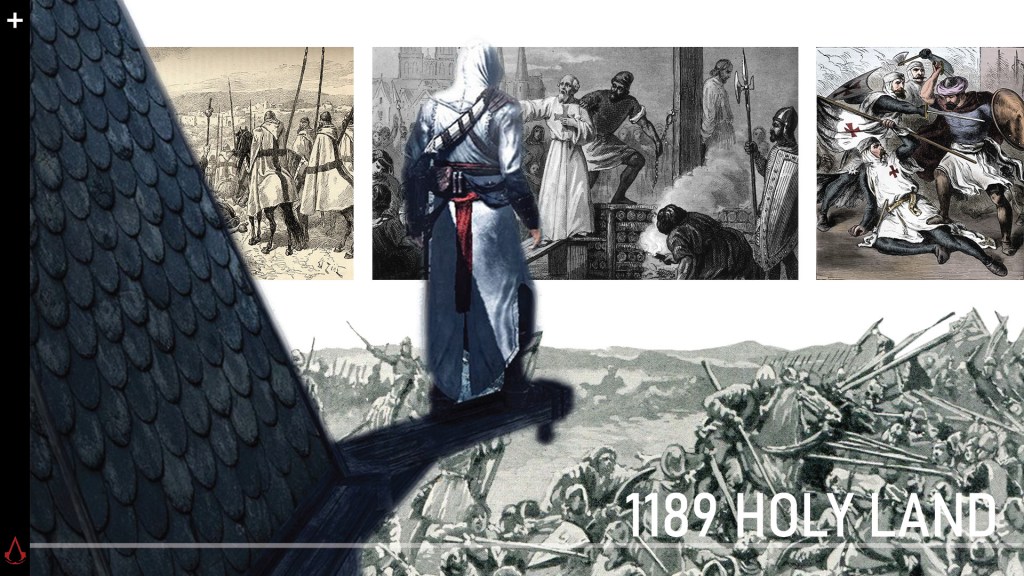
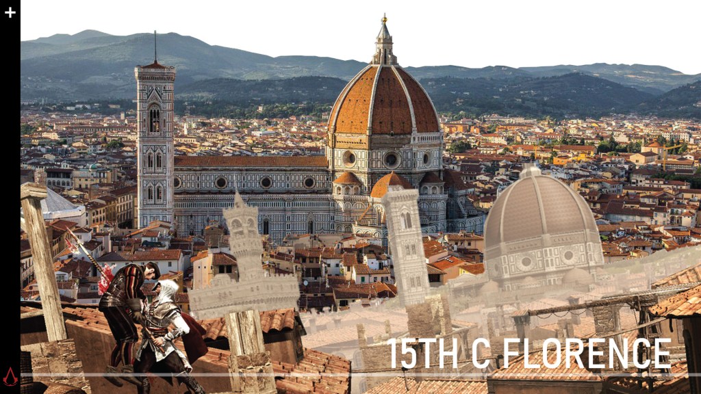
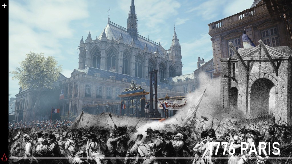
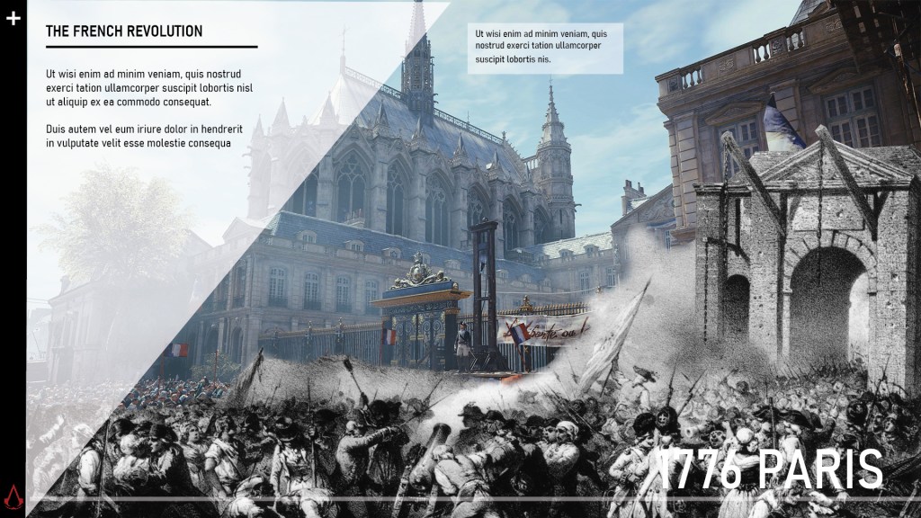
1st Page
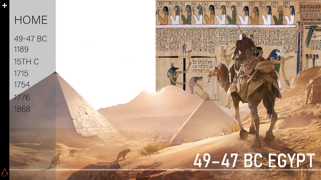
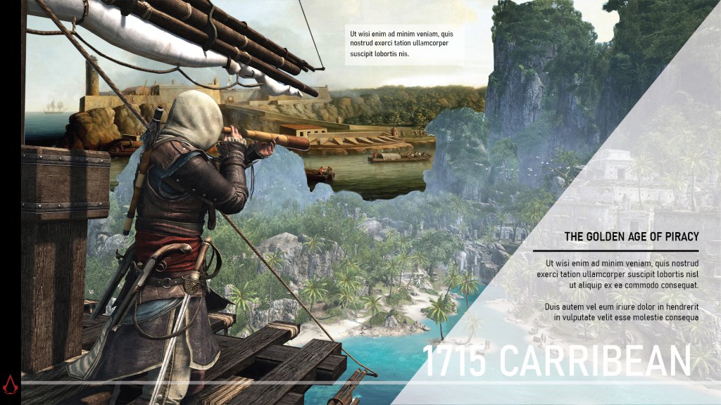
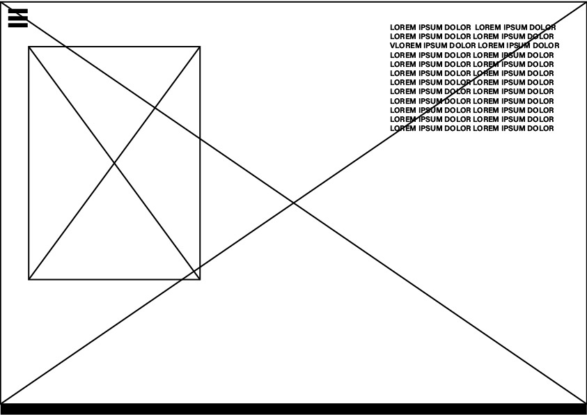
I lost the image for what it looks like when text appears, but it looks like the next page except the triangle is top left like this:
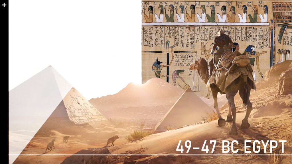
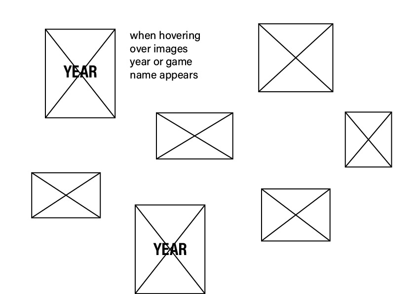
For all my AC game background pics, I want them move up/around when you hover over it. I assume that is scrollmagic?
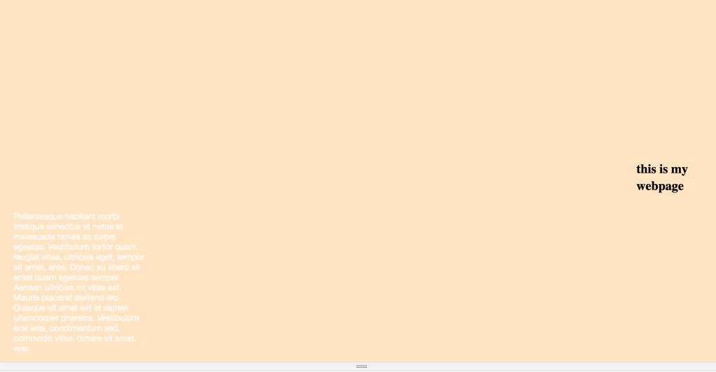
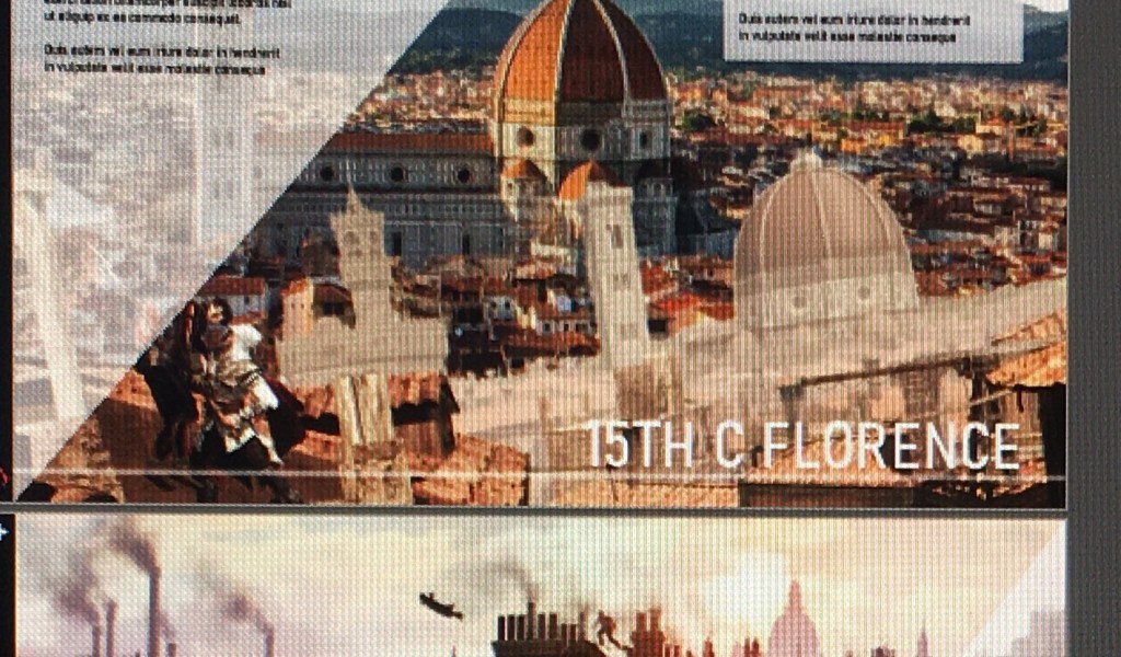
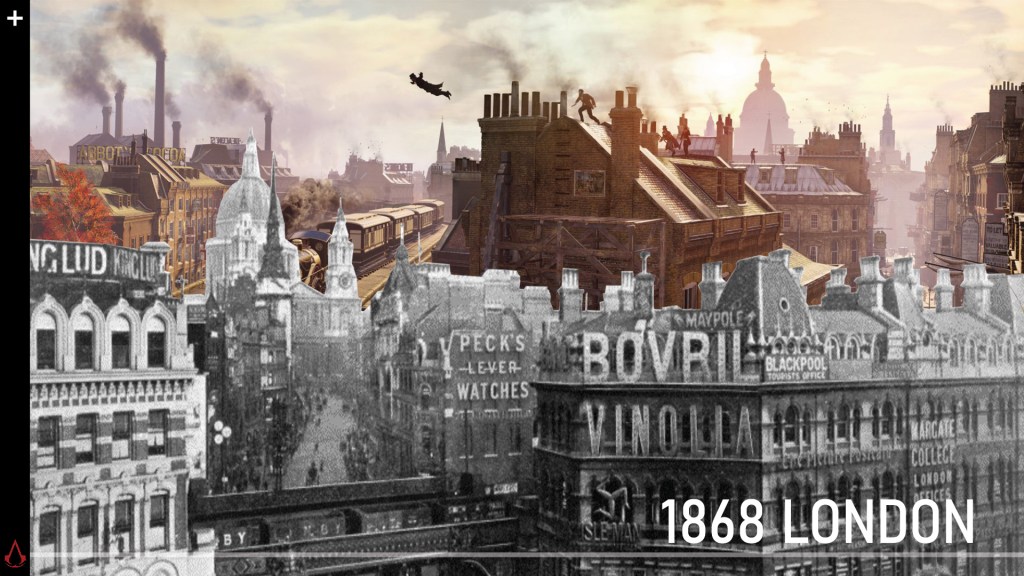
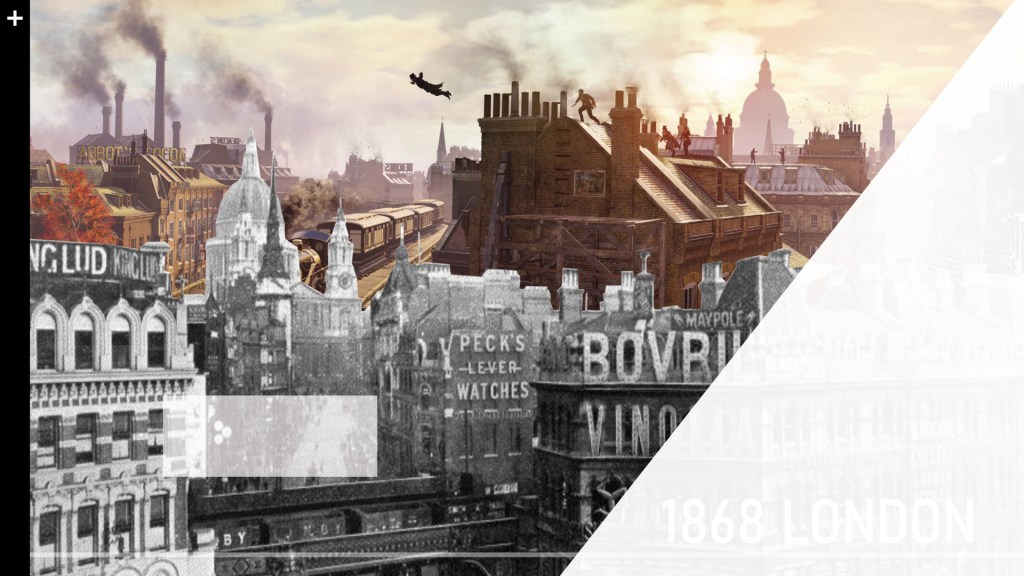
2ND PAGE
Parallax scrolling:
The top three photos need to move to the side when scrolling
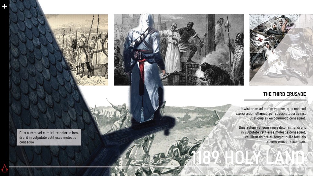
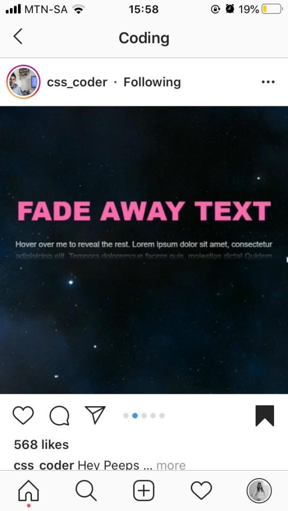
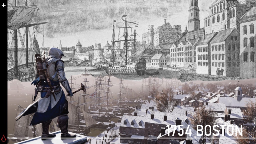
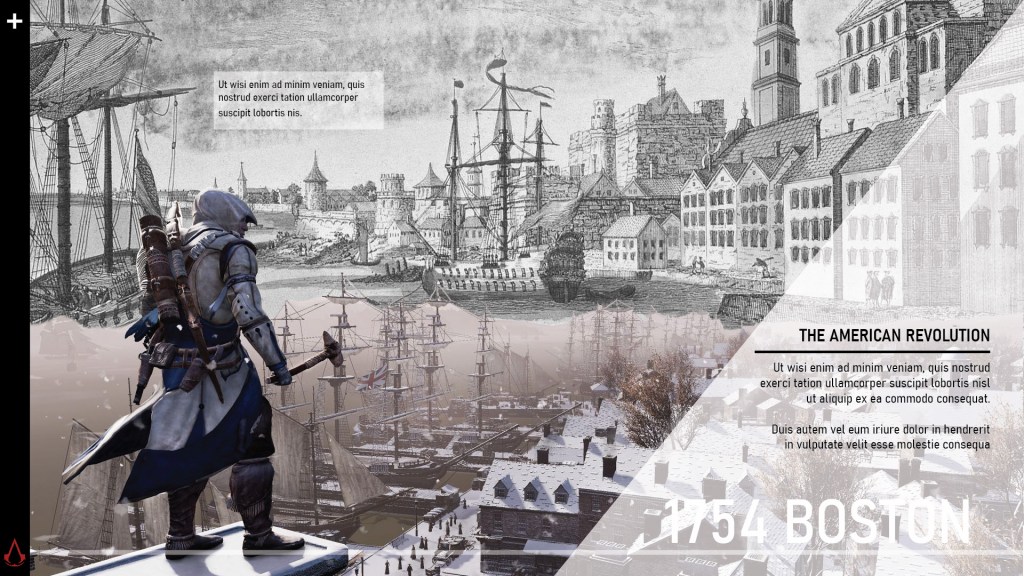
I saw this effect by css.coder and I thought it could be a nice effect for my text.
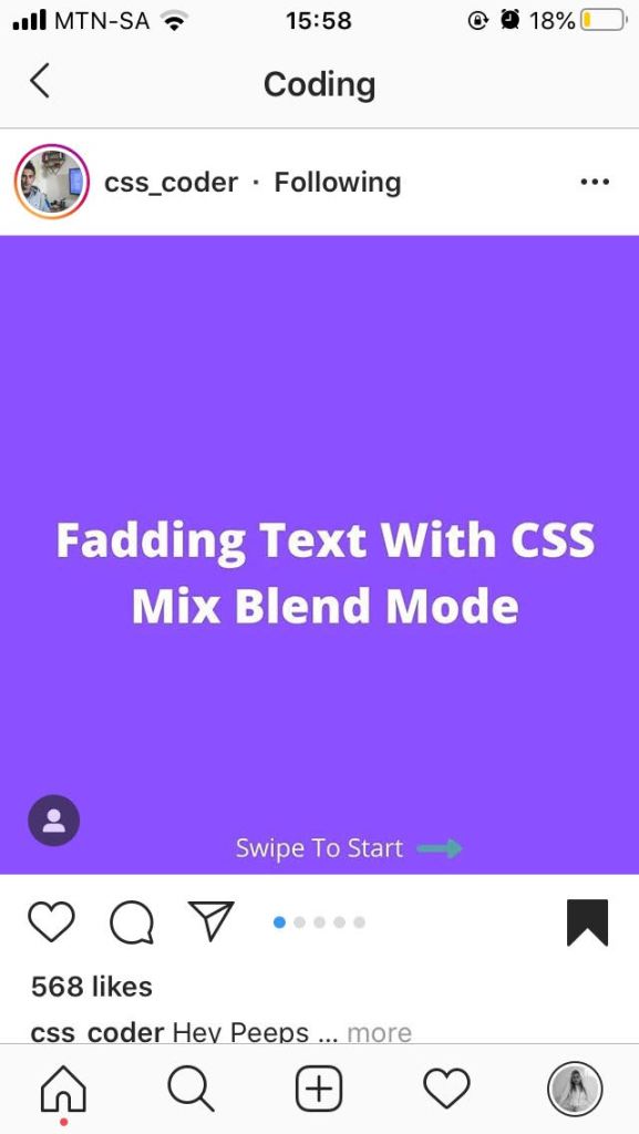
You only see the first sentence and the rest is revealed when hovered.
3RD PAGE
4TH PAGE
5TH PAGE
6TH PAGE
7TH PAGE