This saved my life when I realized I had made my poster a3 and had to copy paste it on a new a1 document. It thrw my layers into one layer and I struggled with getting them into their own layers , losing my prior neatly organized layers panel…
FINAL POSTER PROCESS
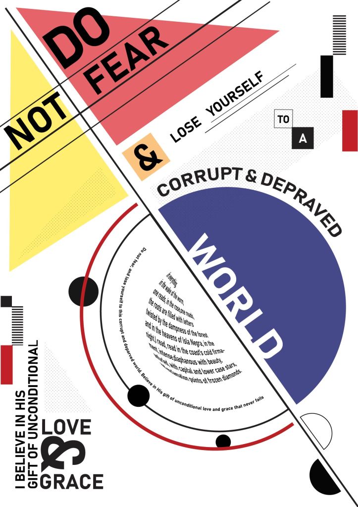
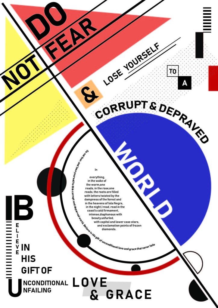
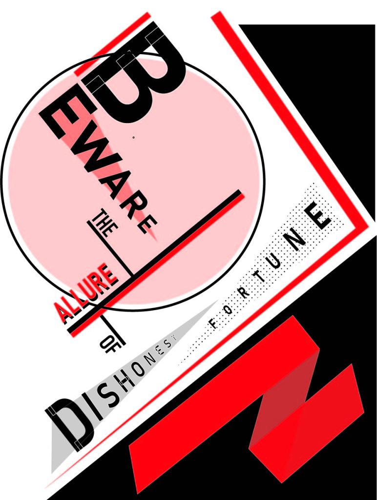
Some things I changed on my poster was adding some dotted shapes for a bit of depth and fill, spacing out the top left corner so that it isn’t as cluttered and more elements in the corners. The rest of my sentence at the bottom of the page was arranged a bit awkwardly, so Werner helped me bymaking the text run up the side which makes it look much cleaner. The “&” is bigger now as it is a nice design element.
My body copy was a bit of a problem. I wanted to turn it into a semicircle and had managed to make the text follow the path, but couldn’t slant it horizontally. After watching a tutorial, I managed to turn my body copy text into a semi circle shape. It warps the text to look as though it is wrapped around a sphere, which gives it a cool 3d look, but I’m not sure whether I’m happy with it…
The other option is to make a few arches of text but I feel that would look too repetitive as there already are 2 other arched sentences and I’d like to mix things up.
Text tutorials
These are some tutorials I watched to help my design…
Bauhaus style drafts
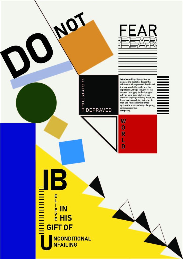
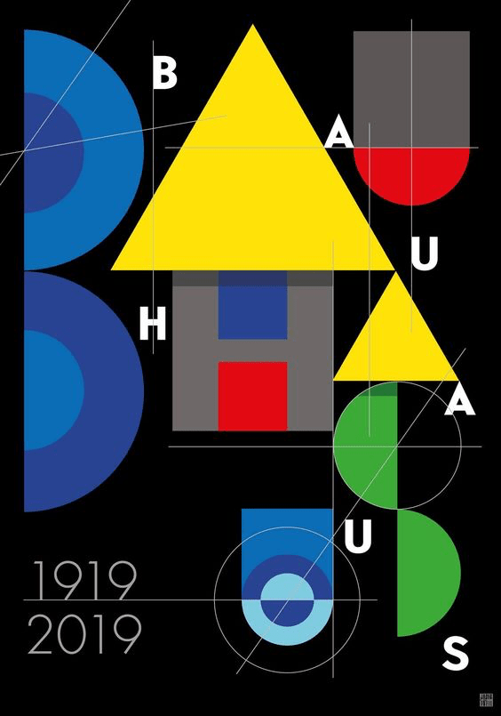
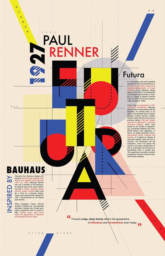
Inspiration: Bauhaus
I found inspiration in the colourful Bauhaus designs and the clean, geometric shapes, lines and layers of Suprematism.
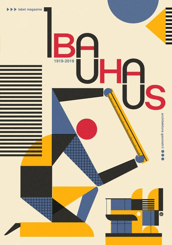
I incorporated lined rectangles and coloured shapes into my poster.
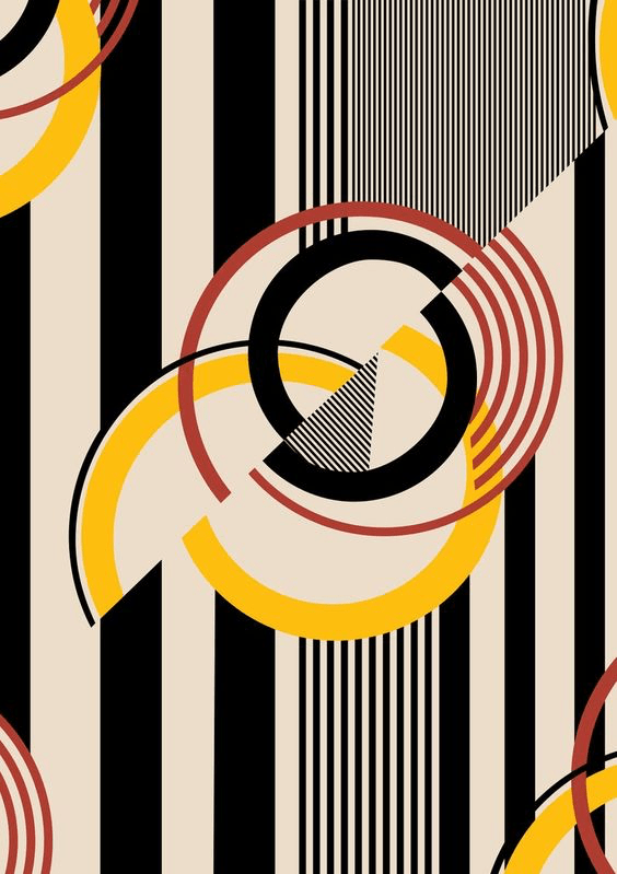
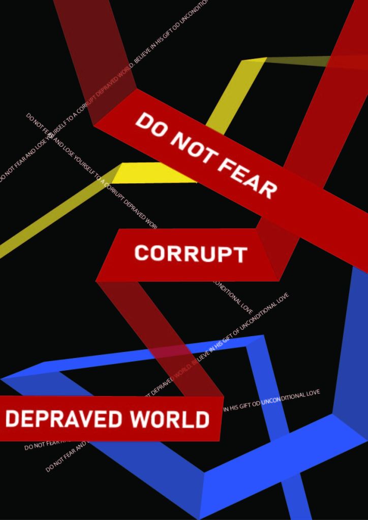
Russian poster drafts
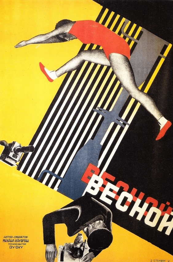
At first I really stuck to the white, red and black collar palette, but quickly tired of it. My first sentence: “Beware the allure of dishonest fortune endorsed by the black market” also sounded too doom and gloom for a motivational poster. I also got stuck around designing the word Beware, and needed a fresh start.
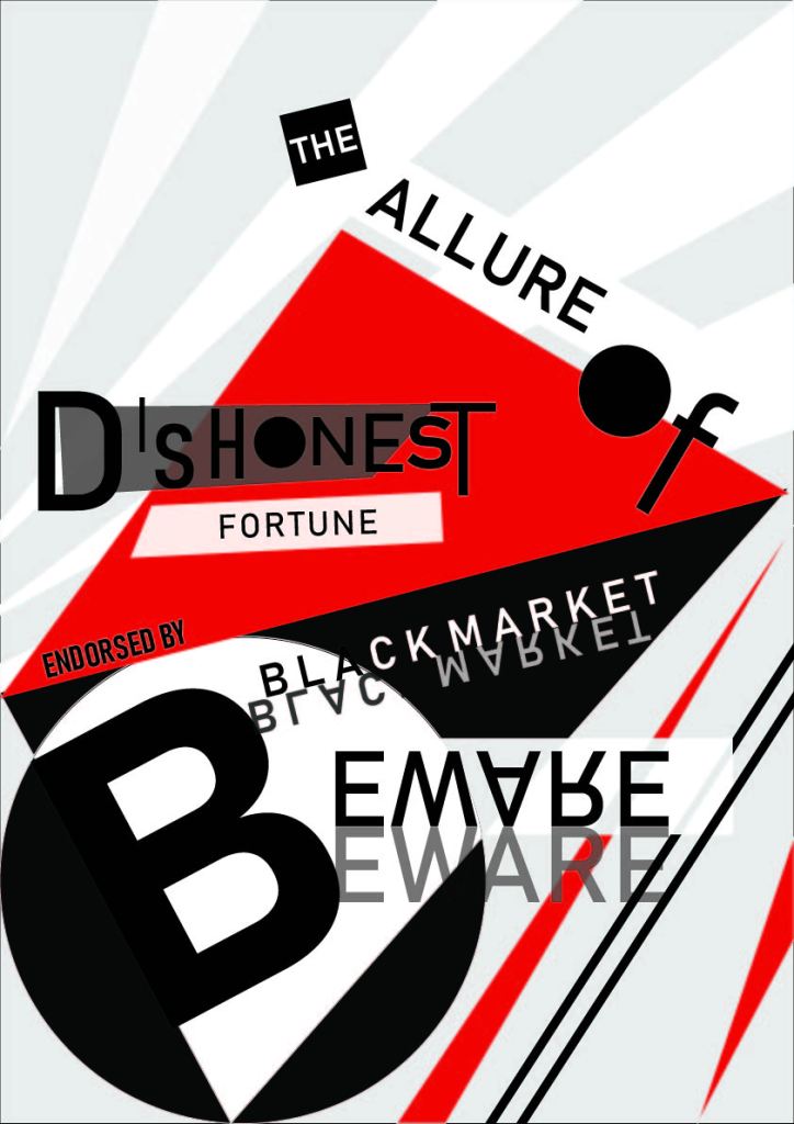
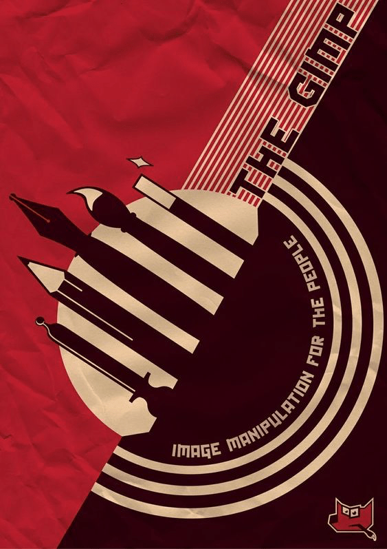
What I do like about this poster style is the collage feeling, and how the words look like cutouts from a newspaper.
MM2: EVENT 1 TYPOGRAPHIC POSTER
When I first started playing aroung with my chosen sentence, I ended up using a lot of black and red as the first word was “beware.”” Red is a warning color and it almost looked like a warning notice. I was inspired by the Russian constructivist style. After further exploration however, I ended up getting tired of the red and black and delved into Bauhaus posters. The many colors and minimalist, geometric shapes and lines appealed to me and I can imagine it would look cool once animated.


EVENT 4: CODING
To start learning coding, we used Dreamweaver and did an exercise on Codecademy.
We learned how to do headers, titles, divide the text, make paragraphs, insert images or videos and make body text. We also learned how to make text bold or italic.
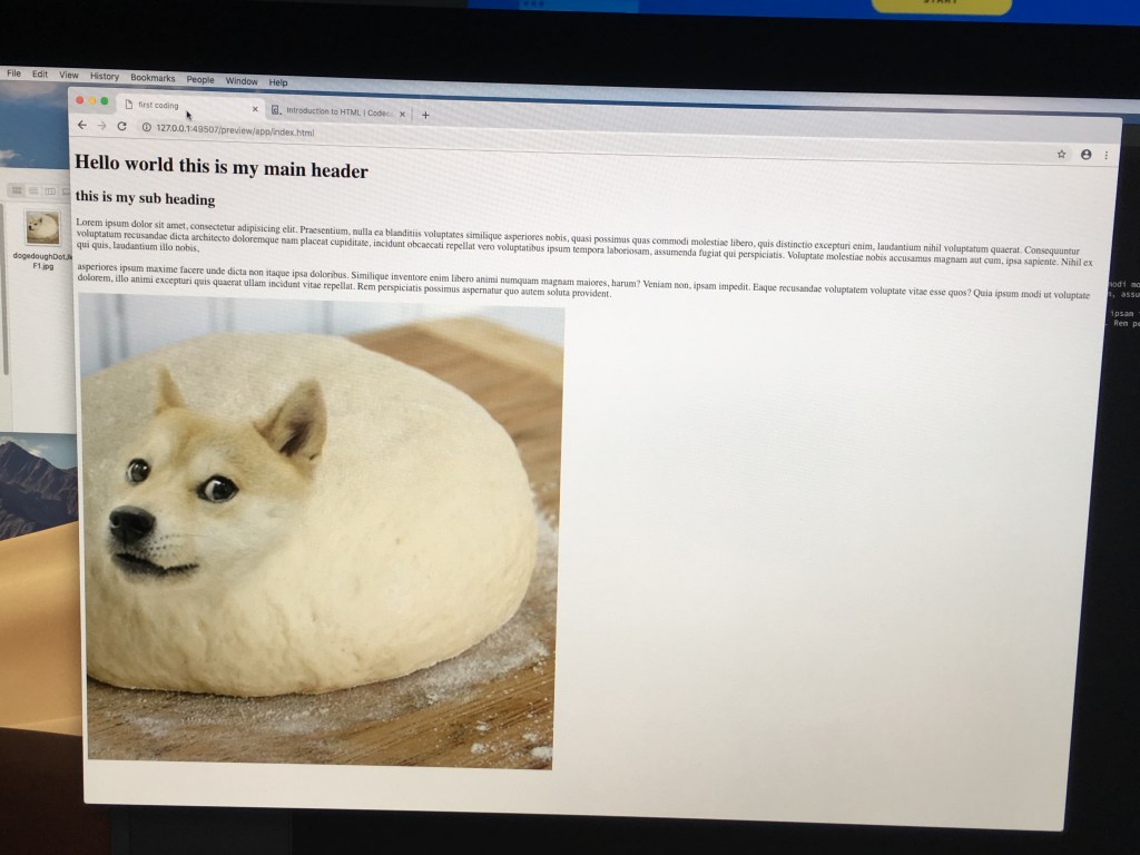
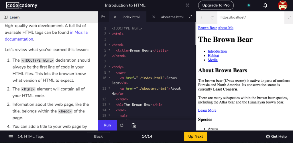
Intro to html exercise
Final Result
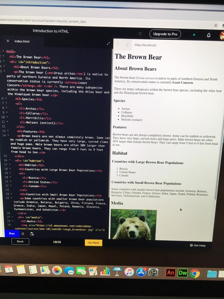
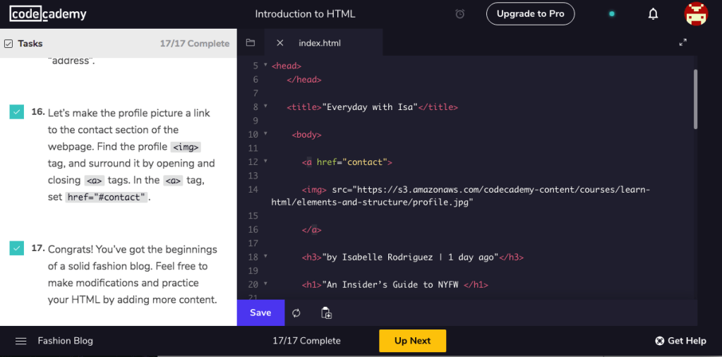
HTML TAGS EXERCISE
I finished the 2nd html exercise…
FASHION BLOG PROJECT
..as well as the final project of creating a blog.
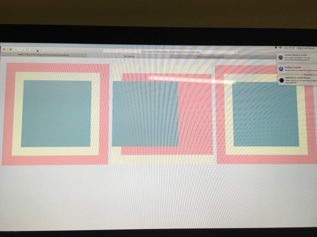
Boxes exercise
The tutorials didn’t realy help because I have the attention span of a toddler, but I figured it out on my own and managed to do the first 2 boxes but I couldn’t really figure the third one ..
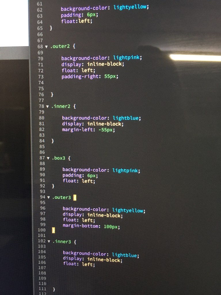
This is some of my css..
E03: USER INTERFACE
RESEARCH
Terms:
“UI, or User Interface, refers to the methods (keyboard control, mouse control) and interfaces (inventory screen, map screen) through which a user interacts with your game. UX, or User Experience, refers to how intuitive and enjoyable those interactions are.”
I looked at some examples of UIs..


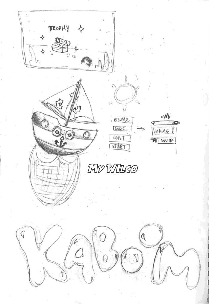
My Concept Idea
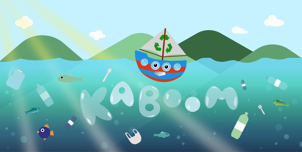
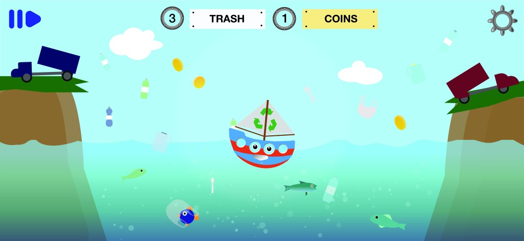
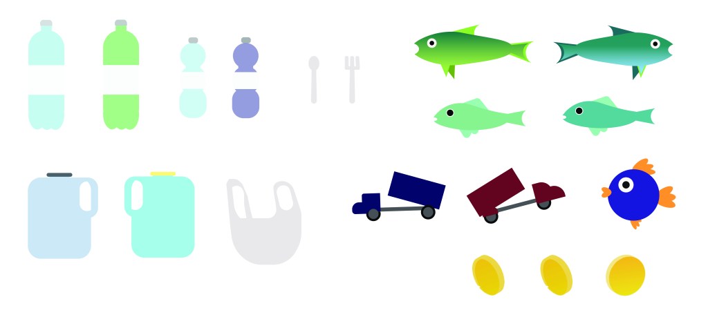
When I heard the character had to be a janitor, I thought of what my character could clean, and the first thing that popped into my head was cleaning the ocean of plastics. My game will therefore be about collecting debri like plastic bottles and bags.

An ongoing ocean clean up project aptly named “The Ocean Clean Up” has developed a technique to gather debri in the Pacific Ocean. This inspired me to make my character Wilco a little boat..

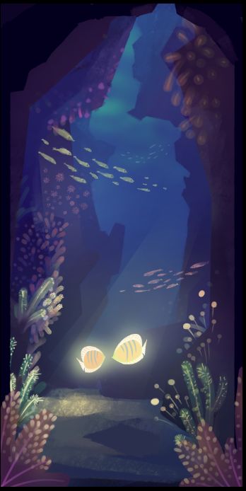
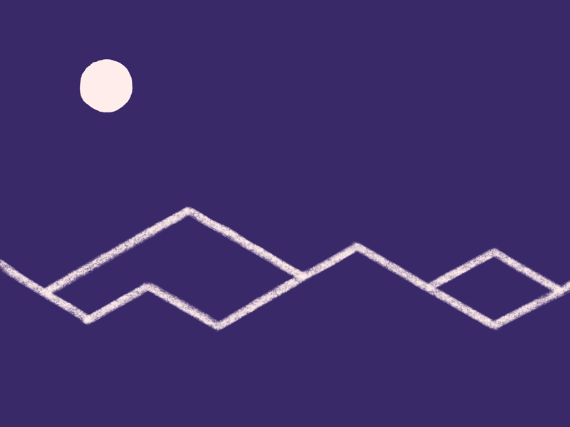
Environment inspo


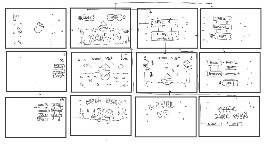
CONCEPT DEVELOPMENT
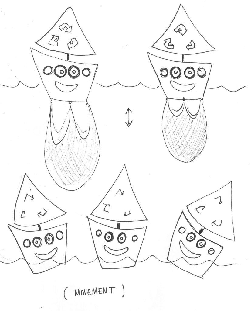
My character is going to be a little boat, with a net collecting the trash. I can’t do a walk cycle of my character but i will make it rock from side to side. The net will go up and down when “capturing” trash.
How he’ll move:
My wireframes
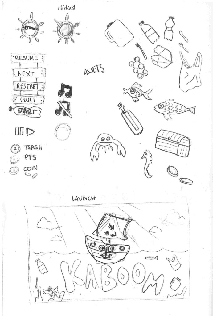
WILCO THE BOAT

SPRITE SHEET
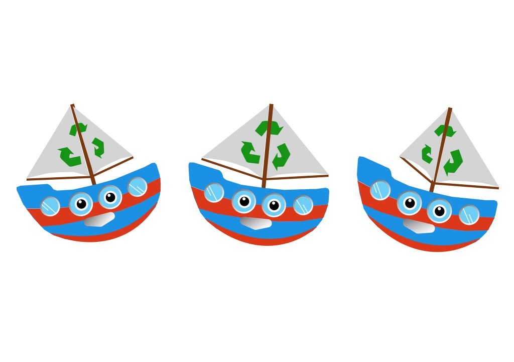
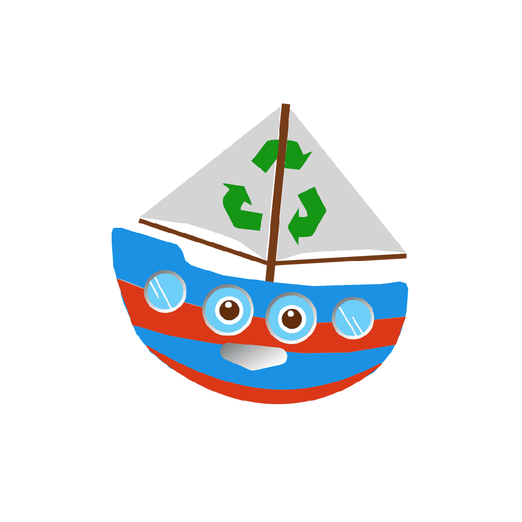
I Changed the net idea because it looked ugly, and used the sail instead to create extra movement. The play screen is going to involve catching trash above water, so the net isnt necessary…
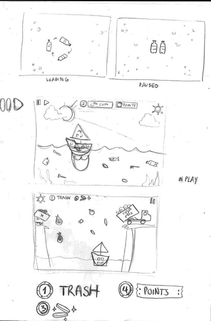
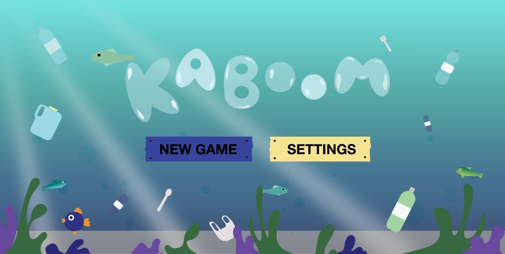
SCREENS

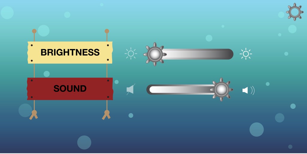
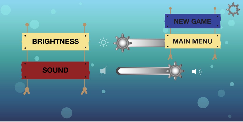

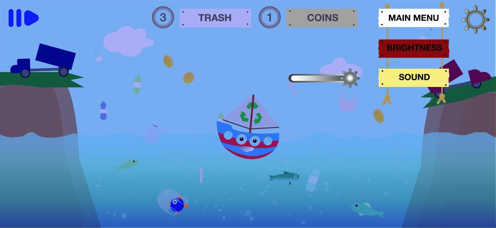
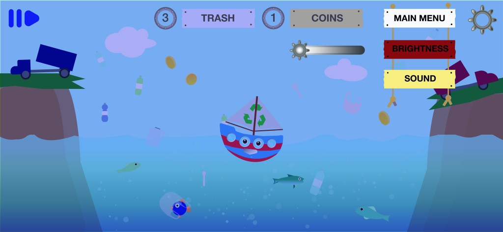
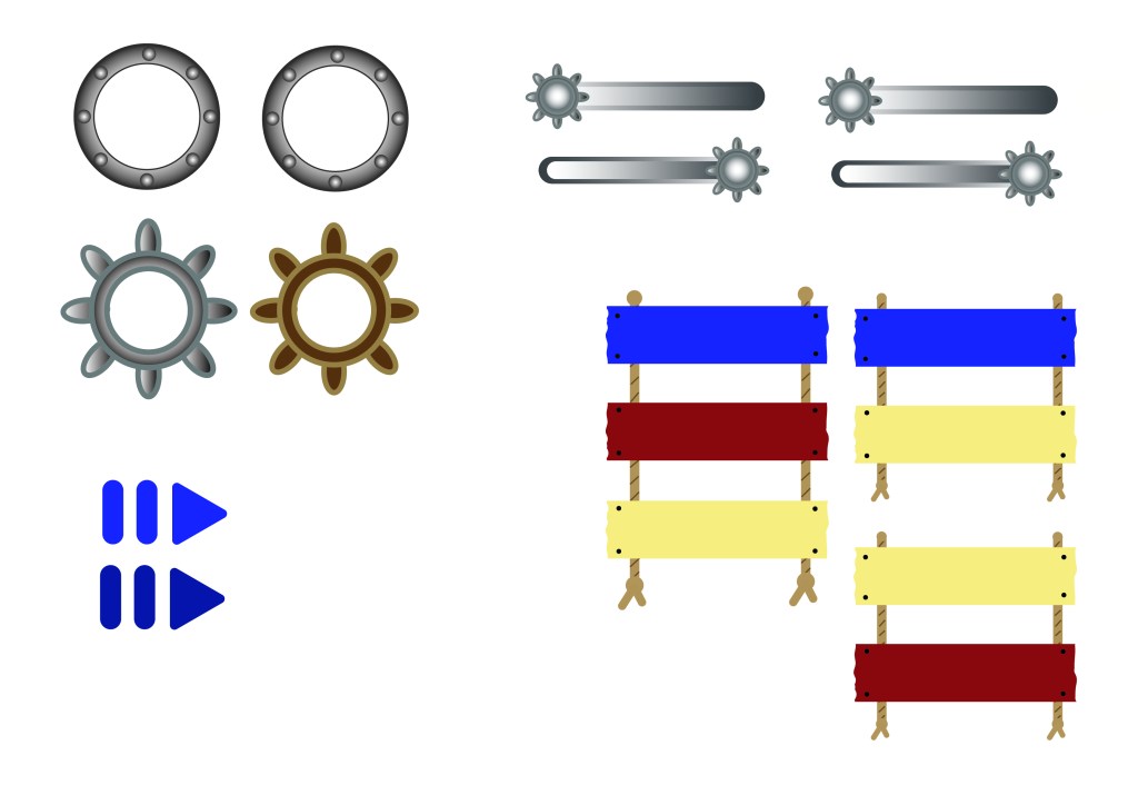
Environmental Assets and Buttons
E02: LOGO REVEALS


BRIEFING
Our new brief is to make 3 different animations on Photoshop, Animate. The 3 logos are Adidas, Spotify and Adult Swimwear. TO understand animation better, we learned the 12 principles of animation:
12 PRINCIPLES OF ANIMATION
- Squash & Stretch
- Staging
- Anticipation
- Straight Ahead and Pose to Pose
- Follow through and Overlapping
- Slow in and Slow out
- Arcs
- Secondary Action
- Timing
- Exaggeration
- Solid Drawings
- Appeal
I rewatched the video we saw in class:
I’ve already looked at a few After Effects animation tutorials after having done the exercise in class, and as there are soooooo many possibilites, I’ve found it hard to decide on animation-logo pairings.
I have thought however, that for Spotify I would like a a type of beating/pulsing effect to imitate a speaker as it is a music app.
As we’ve already been taught photoshop frame animation, I thought I’d start with that, but I’m also having fun playing around in AE.
Here is the exercise we did in class:
We were supposed to be able to do 3 shapes at a time, so I will retry it. I think I have a better understanding now, I just find it impractical that you can’t seem to see the keyframes of the other shape when you’re on the layer of a new shape??
Here I added another star and trim pathed a circle.
FIRST LOGO REVEAL:
AFTER EFFECTS
This weekend, after watching a few tutorials, I found two effects that I thought would look good together. The principle of animation used in this logo is Arcs.
I mostly liked anything that had an electric/neon sign effect and that made your text glow. The tutorials I watched used a plug in called Saber. Once installed there are a lot of options of effects to choose from.
2 tutorials that really helped me were:
After half following 2 tutorials to learn how to install and use it, I had to tweak it to my liking, like changing the color, opacity and the intensity and direction of the glow and other effect. After finishing both comps I dragged one onto the other, and changed the duration such as when the circle is completing its outline glow it is a second slower than the text.
To make both compositions flow I had to make sure the spotify word and logo was perfectly lined up. It rather was a bit of going with the flow and seeing what works, and figuring it out along the way.
NOT SO FINAL BUT ALMOST FINAL RESULT:
I downloaded a whoosh sound effect for when the logo comes in.
CONSULT: After consulting, I found I need to add a few little shapes or things moving around my logo. My first idea is to animate a few scattered, small triangles that appear at intervals around the text and add the glow effect on them. I decided on triangles as the glow effect would make it look too much like blobs, and it seems as though everyone is using circles so it would be nice to do something different. I’ll see how it goes…
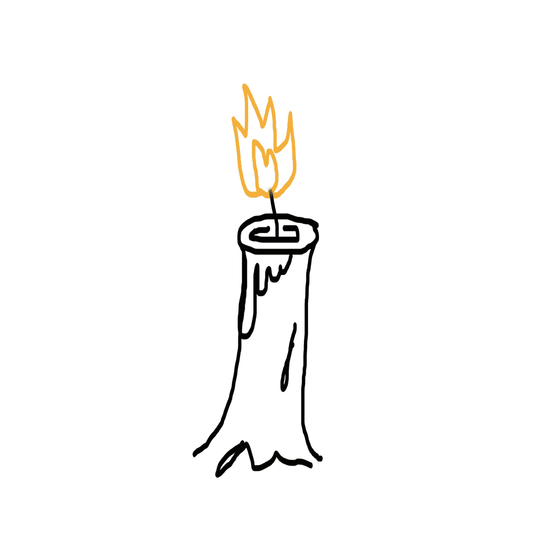
TUT: CANDLE CELL ANIMATION
Today we did Photoshop cell animation exercises from School of Motion. Here I made a candle frame. It was supposed to be slower, 12 frames of 2x but I made the mistake of making 24 1x frames. Oh well.
TIMING ANIMATION EXERCISE

PHOTOSHOP CEL ANIMATION RESEARCH
To find out what types of stuff is possible with cel animation, I looked at what others have created for some inspiration….

I’m not a huge fan of drawing on photoshop with my mouse, as it won’t ever look as good as I want it to be, and it is also veryyy slow work. And bad for my eyes. Therefore, I’d rather do a text based animation, though I like the stretch and squash effect that comes from drawing text like this gif:
As I prefer doing text, I decided to use the Adult Swim logo for my cel animation. So far I have in mind to have the letters change color, and make it glow in a blinking manner like a neon sign. Then, I thought for the logo exit I’d have the brackets form a fin at the end of the logo, and make the logo “swim” to the side, as the name is Adult Swim, after all.
PROCESS
When I first started working on my logo reveal, I the logo stretch and bounce like the gif that inspired me (above). Then I executed my concept of the Adult Swim logo being a fish, swimming into the frame and exiting again. I made bubbles float up in the background and added an underwater sound. I had to look at a few bubble gifs to see how bubbles should move….
Thus, I started working around this theme. My first animation of text appearing and disappearing seamlessly fit in after the fish swims out.
However, I wanted the swimming theme to become the overarching storyline, so for the end of the clip I made the text turn white to symbolize the fish being caught. The logo drips water, as the fish is taken out of the water. Luckily, doing the timing tutorial helped teach me how to make a droplet move realistically.
As the cartoons of Adult Swim look colorful, I chose to use bright colors that stand out against the black background. In addition, the sound effects I chose such as the “boing” sound of the bounce sound very cartoon-y.

As I made quite a few different movements and effects it came as no surprise that my animation was a whopping 18 seconds long…8 whole seconds to o long. Werner was a G and said it was fine though. yeet.
So here we have it…. the done and dusted logo reveal!! yay!!!
ANIMATE LOGO REVEAL
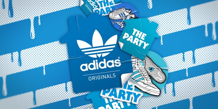
The last logo I needed to animate was Adidas. I was at a loss on what to do for this animation, but this image inspired me to make a paint drip effect:
I went with the blue and white theme, making the logo turn blue, drip paint, have the entire frame become blue and have the logo reappear in white.
The animation principle applied to this animation is Timing and Anticipation.
Animate was tricky to figure out at first, and as we didn’t have a lot of time left to finish it, I kept it simple and wasn’t as ambitious as in my other 2 animations. I eventually got the hang of it though and this is the end result….
The song I used is Pump by Valentino Khan. It was hard to find a song after scrolling through many techno songs and to be honest i’m not even sure if it fits I was just tired of looking tbh lol
