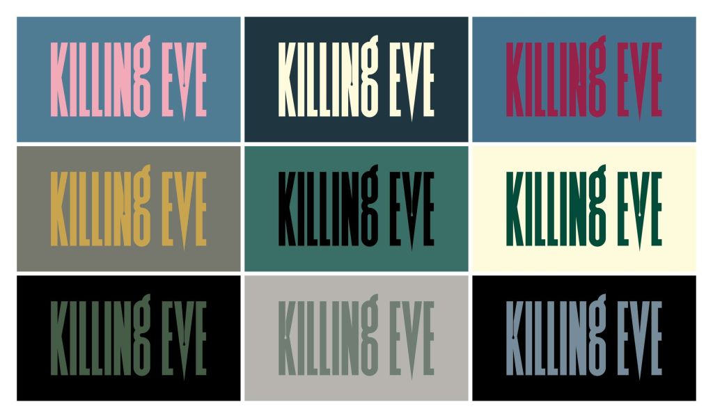
I really liked the colors of the Killing Eve, so I implemented some of them.
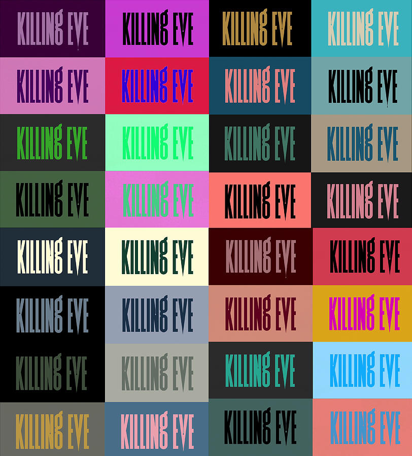
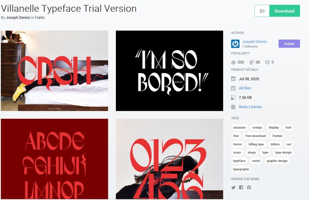
As for type, I found this trial version of that poster typeface? But its not exactlz the same. I like it as an accent font however, not sure if it reads too difficultly though. Im also considering Playfrair Display in extra bold.
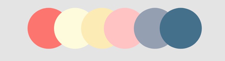
This is my color palette this far.
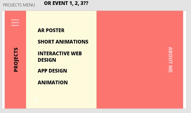
The images and border expand in size and width in a parallax effect, and when you hover and click it leads to the project’s page. You can click through all the projects with the arrows.
Would my name look better in the bottom right corner of the screen? Or is this fine.
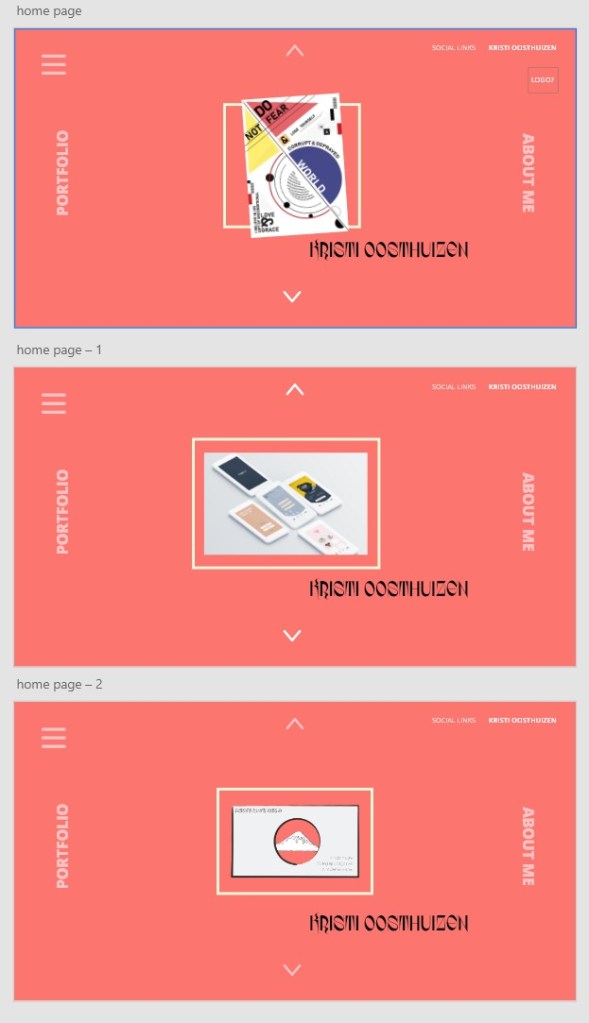
Im not sure what picture to use for the haikus, maybe it should be stills from all three instead of just one? Also should I add a title of what the event is next to the picture or not..