Featured

Animatic so far

I have some things to fix and after watching it through I do want to redraw some frames, I think i rushed some of the last ones and it doesnt fit well with the neater ones.

Also I would like to know how good the drawings are supposed to look, and if we’re being marked for that.. I know its sketches but ARE MINE TOO UGLY OR NOT

It turned out over 3 min and the timing is obviously not exact but yeahhh

Also yes i am aware my deer looks like a llama/giraffe

Featured

Finally finished my rainy cinematic light tut

I added some rain and sound just for funnn and my character looks cuteeee

It took me longer than expected because when I tried importing my walk cycle comp I realized I never looped out my keyframes and it was a 2 sec composition :)) so i had to go through all my layers and loop out. dumb of me.

ANyway I managed alright and really enjoyed this tut as it inspired me for my detailed storyboard scenes. I already planned on doing dark moody, scary atmospheres and now I know how to create that red light I want, as well as light streaming in from windows, candlelight and all that jazzz.

Anddd now I know why it rendered for so long… i made my composition almost 30s instead of the 13s.. ai ek is ook breindood.

Featured

Animation outline and scenes

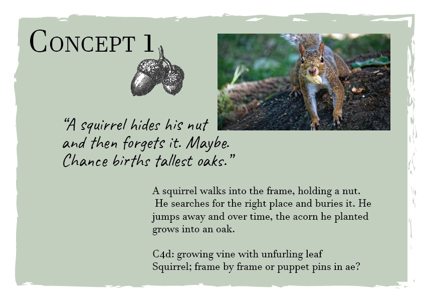
Brief storyline summary

For our brief we had to choose a folktale, and I chose a French story called “Blondine, Bonne Biche et Bon Minon.”
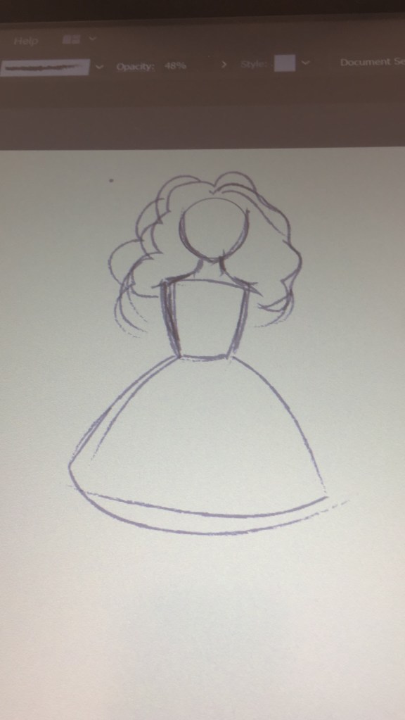
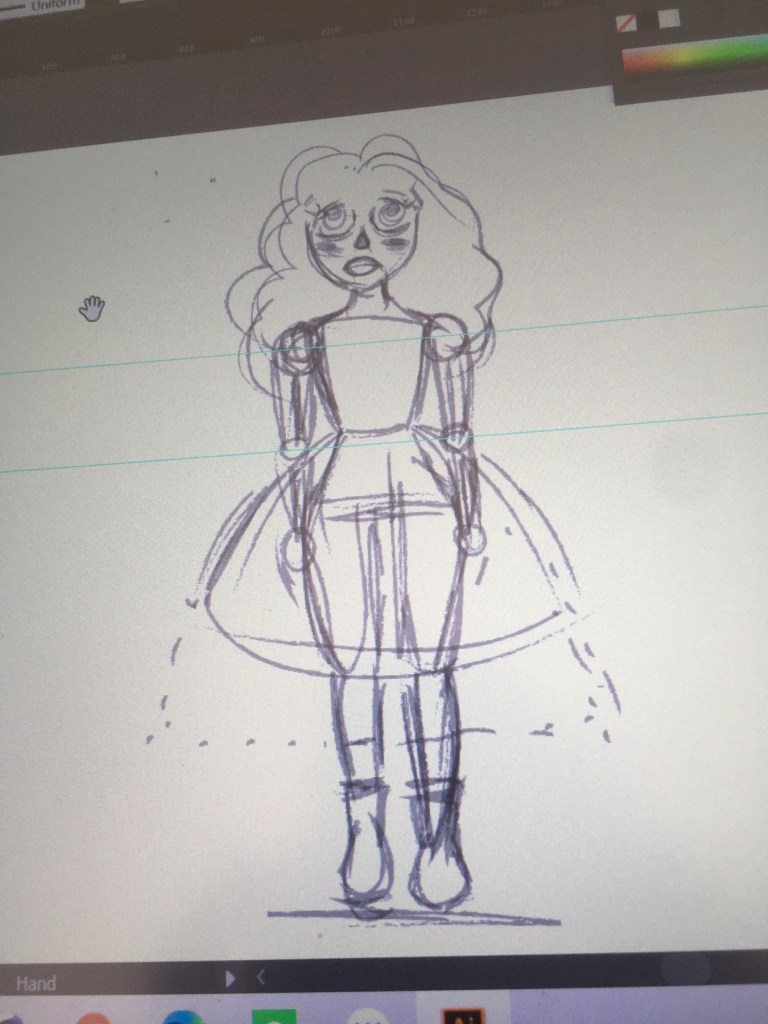
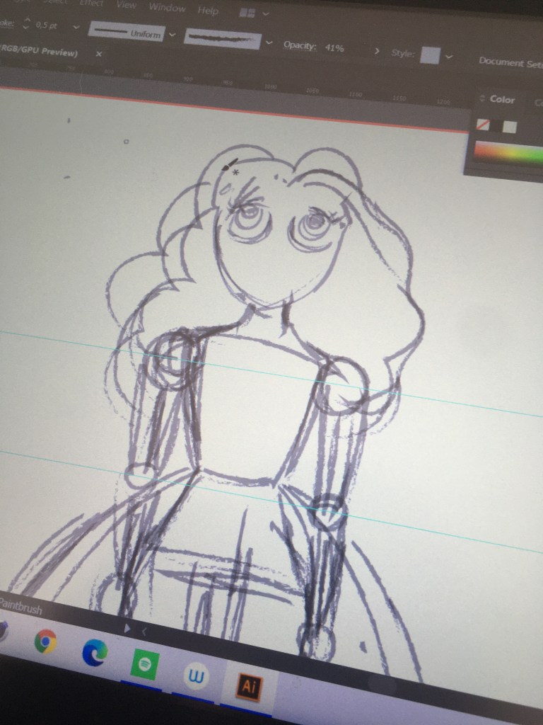
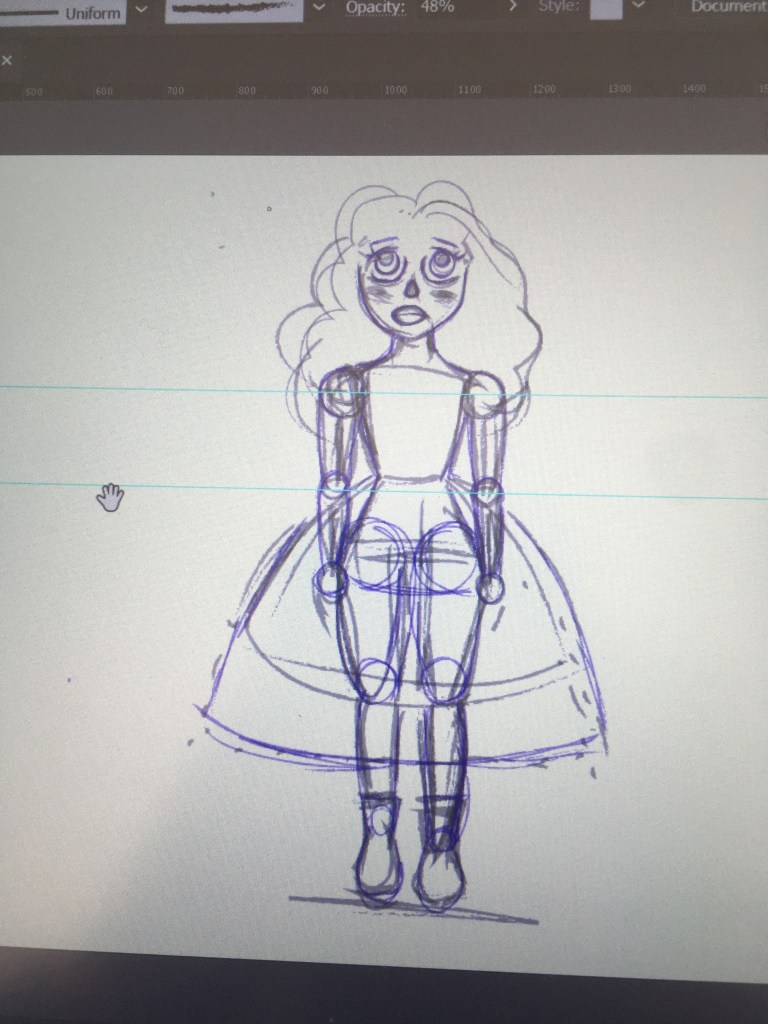
In short, a little blonde princess is tricked by her evil stepmother to enter the cursed magical forest, as she is a jealous woman and hates how much her new husband loves his daughter. Blondine naively goes to pick lilac flowers only to find she cannot return home. Along the way she meets a white cat and a white deer who take her in, and she lives in their palace.
One day a charming parrot visits her, who deceives her, telling her of a red rose she must pick in order to free her from the forest and her supposed capitivity from the white deer.

It is a long story with a long cast of characters, which I will have to adapt and shorten as needed for my animation. The end of the original story has the main character suffer for months, then transported by a turtle to a castle where she finds out the cat and deer are in fact the fairy queen and her son , they were just turned into animals by the evil parrot wizard. The parrot turns out to also be human or shape shifter. At the end she is reunited with her father and marries the fairy queen’s son. It is a long winding tale and the end is too boring…

Beginning

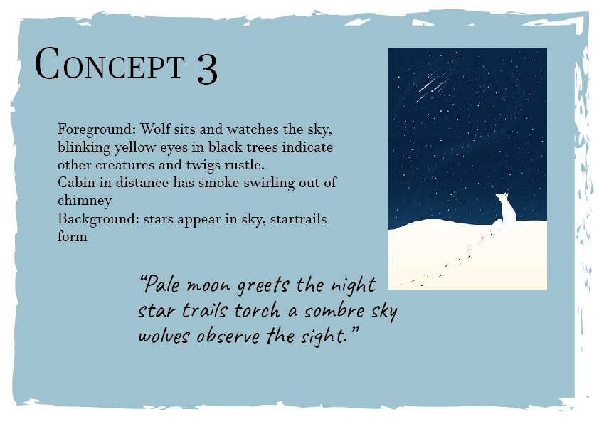
First scene: Sitting on her dads lap on the throne, behind them you see a medieval tapestry of a classic hunting scene, but it features a white deer, cat and a girl riding a tortoise.

Tension buildup

The tension buildup starts when the character cannot escape the forest.

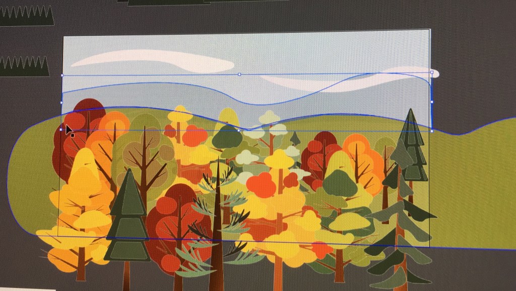
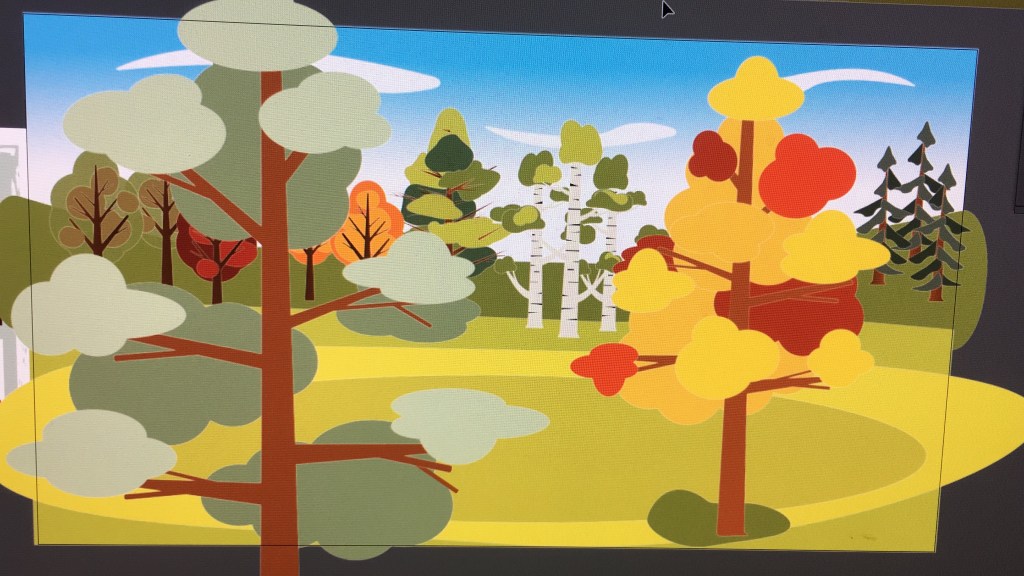
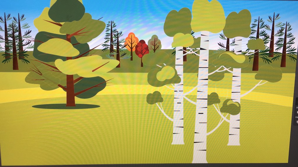
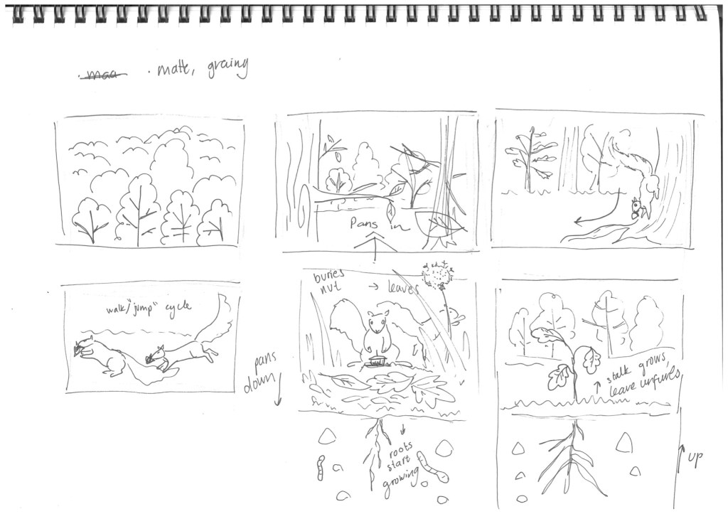
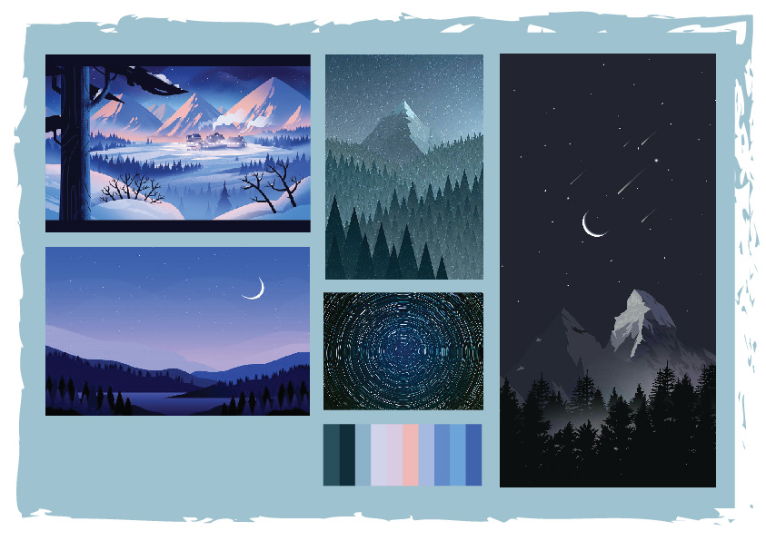
Initially she is peacefully picking flowers and the forest looks beautiful and inviting. When she realizes she is stuck, the environment becomes dark and scary, and trees loom dark and tall around her, branched and thorns entangling her deeper into the dark.

She runs, trying to get away (run cycle scene)

Then she comes across the cat and deer and is taken to safety. (tension dissipates)

Drama

Enter the antagonist: Mister Parrot. A very colorful character so it will make a good scene when he makes his dramatic appearance..

First as a long evil looking shadow then revealed as innocent bird, but it foreshadows what is to come.

Drama ensues when he hypnotizes her with a vision of the magical red rose.

Climax

When she runs towards the red rose, and you see this big glowing red rose that looks alive. I want to make red particles or something float around it.

Close up shot of hand touching it, she bleeds.

Parrot shows his dark evil side, idk if he’ll turn black and then morph into a human shadow or something creepy? I could draw that frame by frame…

Ending

She lies on the ground, and a huge tortoise appears, and carries her away in the mist. Ill either make it a turtle and it swims, or just show the top part of the turtle as I can only make that many walk cycles lol. Unless I can do it in a simple way..

The last scene becomes the same image seen in the tapestry of the first scene.

Featured

Perfecting walk cycle and dress

The separating dress thing worked out the skirt looks good. 10000 troubleshooting and pin and repinning yeeet

Now I just need to move the arms and hair. I noticed in my first walk cycle that she kinda hops too far up in the 2nd up, fixed that, my paths are more oval looking now….Also ill try adding starch pins or something to the upper body bc the chest moves a lot…

Close up of legs

I am blind now. literally i cant see.

Featured

E6 CDP: Character rigging with Duik

I shouldve started simple with the block man but nooo kristi thinks shr knows everything right

So I made a cute dancing lady and started the rigging process,

My legs are one whole shape except for the foot, same arms and hand, and im guessing i should have split it into lower leg, thigh, etc as the duik rig skeleton looks like..because when i linked the ai parts with the controllers i obviously couldnt link to each part.

Which may be why my hands and feet disconnect from the body when i move my controllers…

So I need to adjust my ai file and start over, and shouldnt have wasted time and just done the space man but that is how we learn when we think we’re clever isnt it lol

Featured

E5: Intro to Adobe XD and wireframing

I could finally get going after wifi frustrations.

First up just reading about what goes UI design is and watching the aero and other tutorials on how to use XD…

It lowkey took me a while to get used to it and i Just figured out that you need to drag the artboard name to move it and i feel dumb for struggling haha

Firstly I’ve taken a look at a lot of Behance projects to see what they included in their app, and of course the latest tut on aero really helped me understand what screens I need to do and how to go about it. I honestly felt really overwhelmed getting into this and didnt really know what to do to start and its taken me so much reading I havent even decided on the look and feel of my design.

I have however looked at things I liked and now know what I want to incorporate in my design

I definitely want to include a lot of soft colors into my design, and make cute vector illustrations. It’ll help draw users in and though animal adoption apps may attract all ages, I suspect it tends to attract young kids/people begging their parents for a dog.

Splash and Onboarding screens

I really like the dot/swipe what do u call it thingy idea to introduce your app to the user.

So far I’ve been outlining/mapping out my layouts, what each screen will say, so I know what assets, illustrations etc to design.

Featured

CDP Controller parallax for landing page

I applied the 4th parallax tut to my landing page, here is some documented progress…

First I made my 2 containers, the assassin is the controller. I sukkled a bit with positioning at first then realized it was because the way i saved my triangle pngs was that they were small on a canvas instead of full size.

Anyway then I added cute border shapes…. they move a bit more than the images inside.

SOme more cute lil elements

Complicated ass code. I thought I did it wrong then I continued the tut and saw you did it wrong at first lol

Featured

Linking a div

I am working on my landing page which is going to have a lot of links on it, and realized i had to do it differently as I hadn’t made my pages different htmls. My pages are just different divs on index.html.

Luckily I figured it out. You just need to give your div an id, and then link your href to that id #.

Yeeet i am a hacker man dan

Featured

DESIGN CONSULT FEEDBACK

As per consult, I made all pages hald black and white half color. I also corrected some of my assets so that the images blend into eachother better.

For this one, I cut the foreground pic in two and made it half b&w. It looks more multi layered now.

I just made this bg pic b&w…

Now everything looks more cohesive:

As you can see I’ve also experiments with making the dates big and low opacity aqs background elements. Not sure if they should be positioned the same on each page, as for some pages it looks better elsewhere due to the images…

Featured

Website Design

Some process images

LOADING SCREEN

Images: Like scrollmagic bonus vid effect

CODE PEN LOADER:

Moving clouds background


LANding PAGE

So BASICALLY het my ai design doc nie reg gesave nie so ek het van my goed verloor. Was seker te moeg gister aand idk. But i had some pics on my phone so u can kinda see whats going on

The landing page’s design is the one page I’m undecided about design wise. Assassins Creed’s loading page is that white background with weird moving white line things. So I thought I’d imitate that effect but with triangles.

My idea for my landing page is to put the assassin pic in a container and when you hover him, the other shapes move like in your 4th parallax tut.

Assassin = controller, when you hover him the triangles move around

I dont know if I should make some of those pictures^ smaller triangles and put them inside the white line triangles, or if itll look cleaner with just the shapes. It might look nice if all the images are b&w.


The START YOUR MISSION can be a button, but because you just scroll right it might be kind of pointless.

Navbar is a classic slide out menu, but I thought I could turn the timeline into a navbar as well where you can hover over the dates and it links to the pages.

Or: Scrollbar/process thingy? I wanted to find a tut for something like this but idk what you call it.

1st Page

I lost the image for what it looks like when text appears, but it looks like the next page except the triangle is top left like this:

For all my AC game background pics, I want them move up/around when you hover over it. I assume that is scrollmagic?

2ND PAGE

Parallax scrolling:

The top three photos need to move to the side when scrolling

Likewise here the b&w pic should also move
When you hover over the left pic the text box appears

I saw this effect by css.coder and I thought it could be a nice effect for my text.

You only see the first sentence and the rest is revealed when hovered.

3RD PAGE

(Phone pic bc I lost this image as well)

4TH PAGE

5TH PAGE

6TH PAGE

7TH PAGE

Featured

E3: Briefing Motion Graphics haiku

Today we were briefed on our new haiku brief. We need to make 3 40 second animations of 3 different haikus, using cinema 4d, after effects and illustrator. *remember mt mograph motion plugin to download*

I’m trying to find ways to animate text and other effects so I went and searched for animation tutorials I could use:

Haiku ideas so far:

Featured

CDP: CINEMA 4D

Today we started working with cinema 4d and Werner took us through all the tools of the software.

Notes:

alt g group objects

click and drag one layer to another, arrow down means parent, left arrows places it in between

symmetry, dear shape in other shape gives mirror effect

in timeline double click to create, change colour etc the drag it onto your shape

right click on object, line cute make own selection for segment

SKateboard: make plane, select edges, extrude tool, drag out and bend up. Select nodes at ends, right click bevel and drag to round. elect middle edges, drag

to download: vfxmed

Featured

Roar and final animation

Making my bodycopy text bigger only increased visibility by a little, but at least you can see it now. My arched sentence is much better though as the text could be made much bigger and bolder.

Something I don’t understand is that every element is in the right place in my animation, such as the planets following their paths on the lines, but when I put it in roar everything stays a bit out of place no matter how much I try and experiment with resizing. It may have to do with the alitude but I couldn’t change it that much as the video layer needs to be a specific height above the other shapes.

^When I edit in roar the video layer is correctly placed above my shapes but when scanned it goes a bit off:

Featured

The Struggles of Roar/process

Getting to know Roar the past few days wasn’t the best experience. It seems the want to make it difficult instead of easy to use. It’s even hard to select objects as it just moves your whole background around and drives you mad.

Then it looked like my pngs have a box around them, which it shouldn’t… and I though I couldn’t fix it but magically they disappeared once you look at it in AR.

I realozed I had to take almost everything out of my animation background, as it didn’t look good when you’d see double of some elements and it just looked off. Now the background seems quite empty though.

Another problemo is that the bodycopy animation comes out so faint you can barely see it. It may be due to the green screen…soooo I might still change my after effects background to transparent and see if that changes anything,

This is it so far, basically finished besides the bodycopy problem. The app messed with the colors too for some reason…

Featured

MM2 EVENT 2: AFTER EFFECTS ANIMATION

Today we are setting up our Roar accounts and being shown how to make our layers into assets for importing to After Effects.

Some things I need to remember are:

  • Dividing my shapes up in layers according to how I wish to have it animated
  • Roar only allows 4 layers
  • Remember to make the backgrounds transparent when exporting.
  • export as mp4s
  • From Ai to Ae: double click where u import files, Import, file, select ai doc, import as composition retain layer size, it keeps all the layers.
  • Release groups to sequence to make 4 layers
  • (select main layer, options)
  • Ae: create, create shape from vector
  • keyframe shortcut: U
  • Choose font with bold and light, make 2 text layers
  • create shape from text layer
  • double tap U on shape layer, select all paths by holding in cmd, click top keyframe thingy, makes keyframes for all of them. Then, click U once on shape outline layer and click it again. This will make only the path keyframes appear dropped down.
  • snapping tool at bar in top
  • scrubber: cmd arrows is 1 frame at a time
  • cmd shift is 10 frames at a time

We went through the basics of animating shapes in After Effects again, and were shown hoe to make gradients, change path shapes etc.

Then we made our names into shapes and animated the letters to go from bold to light and vice versa.

Featured

FINAL POSTER PROCESS

Some things I changed on my poster was adding some dotted shapes for a bit of depth and fill, spacing out the top left corner so that it isn’t as cluttered and more elements in the corners. The rest of my sentence at the bottom of the page was arranged a bit awkwardly, so Werner helped me bymaking the text run up the side which makes it look much cleaner. The “&” is bigger now as it is a nice design element.

My body copy was a bit of a problem. I wanted to turn it into a semicircle and had managed to make the text follow the path, but couldn’t slant it horizontally. After watching a tutorial, I managed to turn my body copy text into a semi circle shape. It warps the text to look as though it is wrapped around a sphere, which gives it a cool 3d look, but I’m not sure whether I’m happy with it…

The other option is to make a few arches of text but I feel that would look too repetitive as there already are 2 other arched sentences and I’d like to mix things up.

Featured

MM2: EVENT 1 TYPOGRAPHIC POSTER

When I first started playing aroung with my chosen sentence, I ended up using a lot of black and red as the first word was “beware.”” Red is a warning color and it almost looked like a warning notice. I was inspired by the Russian constructivist style. After further exploration however, I ended up getting tired of the red and black and delved into Bauhaus posters. The many colors and minimalist, geometric shapes and lines appealed to me and I can imagine it would look cool once animated.

Russian Constructivism

Design a site like this with WordPress.com
Get started