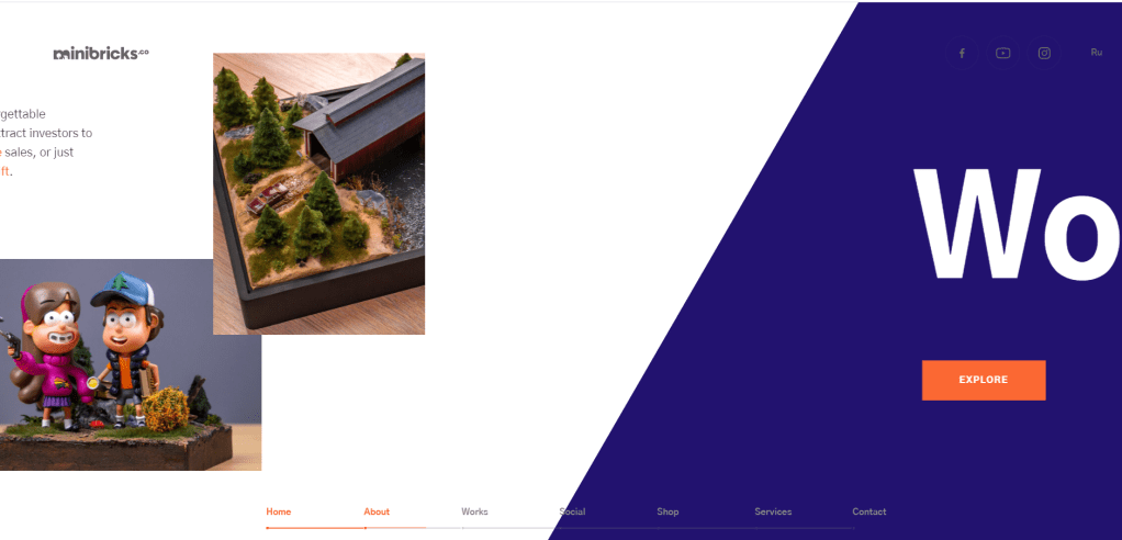
I looked at another cool website, and liked how the images overlays and continues into the next page, or just the idea of triangular images:
The little nav bar at the bottom is also nice, it might be useful to have that breadcrumb thingy at the bottom like O-O-O-O. O I want to keep the timeline bar at the bottom of each page as a design element so you feel like you’re scrolling down the timeline of history, so the breadcrumb can be on the line.
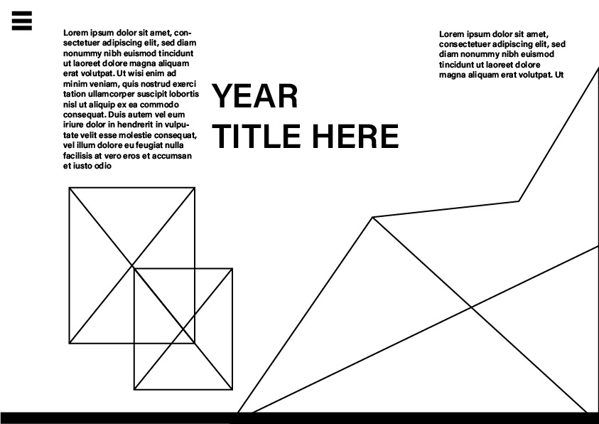
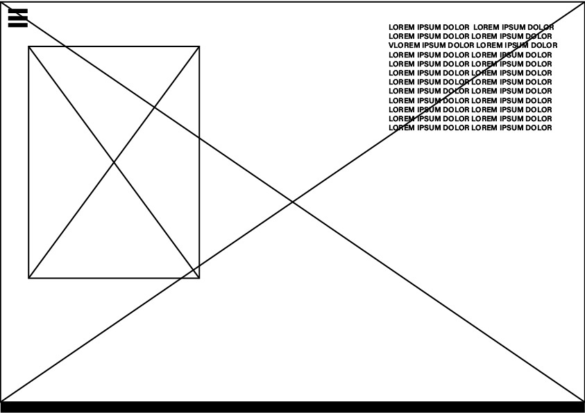
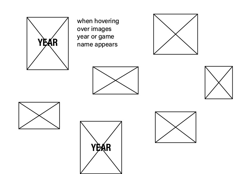
Where text and smaller images are placed will be determined by how much I will need to write and add. As I do not yet know how many assets I will have per page, and how much I will write I cannot really have my final design. However, this is pretty much the feel I’m going for. I do not want it to look overcrowded.
I found a css tutorial on how to make text appear/expand when you hover over it. So it looks like there’s just a sentence and when you mouse over it the whole paragraph appears. This could help it look clean and minimal even if I have quite a bit of text.
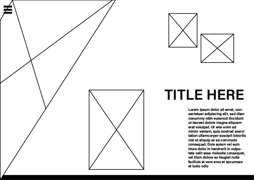
Here is an alternative main/overview screen to the one I did before: