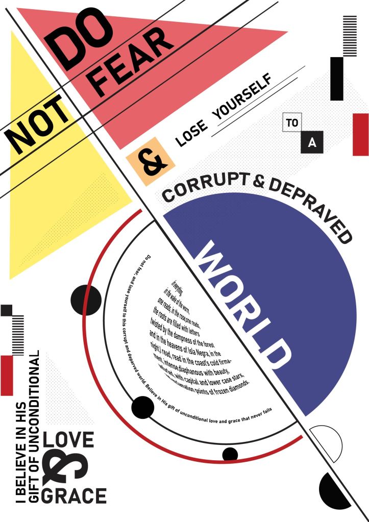
Some things I changed on my poster was adding some dotted shapes for a bit of depth and fill, spacing out the top left corner so that it isn’t as cluttered and more elements in the corners. The rest of my sentence at the bottom of the page was arranged a bit awkwardly, so Werner helped me bymaking the text run up the side which makes it look much cleaner. The “&” is bigger now as it is a nice design element.
My body copy was a bit of a problem. I wanted to turn it into a semicircle and had managed to make the text follow the path, but couldn’t slant it horizontally. After watching a tutorial, I managed to turn my body copy text into a semi circle shape. It warps the text to look as though it is wrapped around a sphere, which gives it a cool 3d look, but I’m not sure whether I’m happy with it…
The other option is to make a few arches of text but I feel that would look too repetitive as there already are 2 other arched sentences and I’d like to mix things up.
